Tokenized Design System
Building a design system that could scale with the product.
As nera grew, our Design System needed to grow with it.
I led the redesign of the Design System from the ground up, partnering with two designers to build a token-based foundation while defining the standards and governance behind it.
Our goal wasn’t to build more components - it was to create a system that every designer and developer could trust.
The Challenge
nera’s original Design System came from an external agency. While it gave us a starting point, the handover lacked documentation, governance, and a scalable structure.
As the product expanded, the library became harder to maintain. Components multiplied, inconsistencies appeared, and design decisions depended more on individuals than on the system itself.
Rather than patching the existing library, we rebuilt it from scratch.
No Tokens. Too Many Variants.Without tokens, consistency relied on manually matching colors, spacing, and typography.
Every new requirement introduced another component variant instead of strengthening the system.
The library kept growing - but it wasn’t becoming more scalable.
Built to Grow, Not Just ShipThe original system worked for the first version of the product.
But nera quickly expanded with:
New banking products
Arabic & English
Light & Dark themes
More designers contributing
The Design System needed to support change - not slow it down.
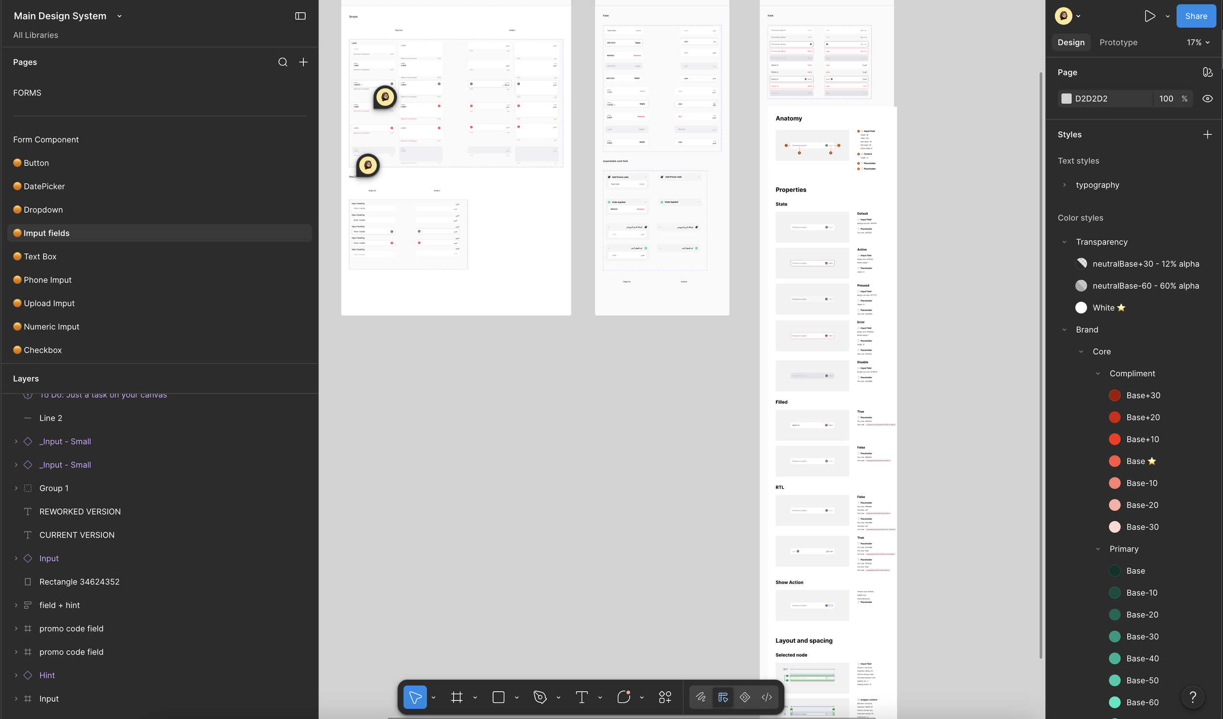
Old Design System → too many variants
Why Tokens?
We introduced design tokens as the single source of truth.
Colors, typography, spacing, radius, and other foundations were defined once and referenced everywhere.
Updating a token automatically updated every component and screen that depended on it—keeping the product consistent across languages and themes.
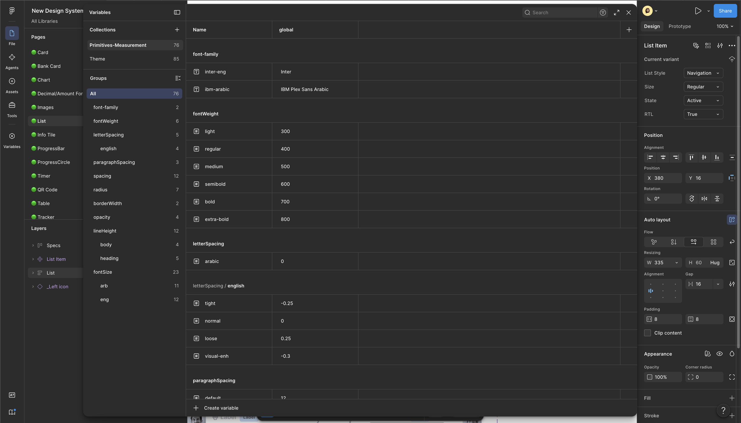
Foundations (Tokens)
Every visual decision became a reusable token.
Colors
Typography
Spacing
Radius
Borders
Elevation
Opacity
The architecture also supported multiple themes while maintaining consistency across Arabic and English.
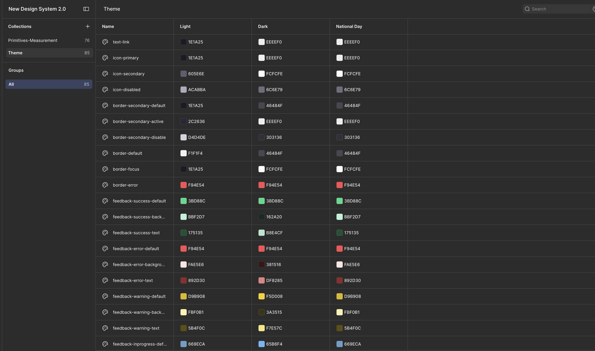
Three Themes Considered (Light - Dark - National Day)
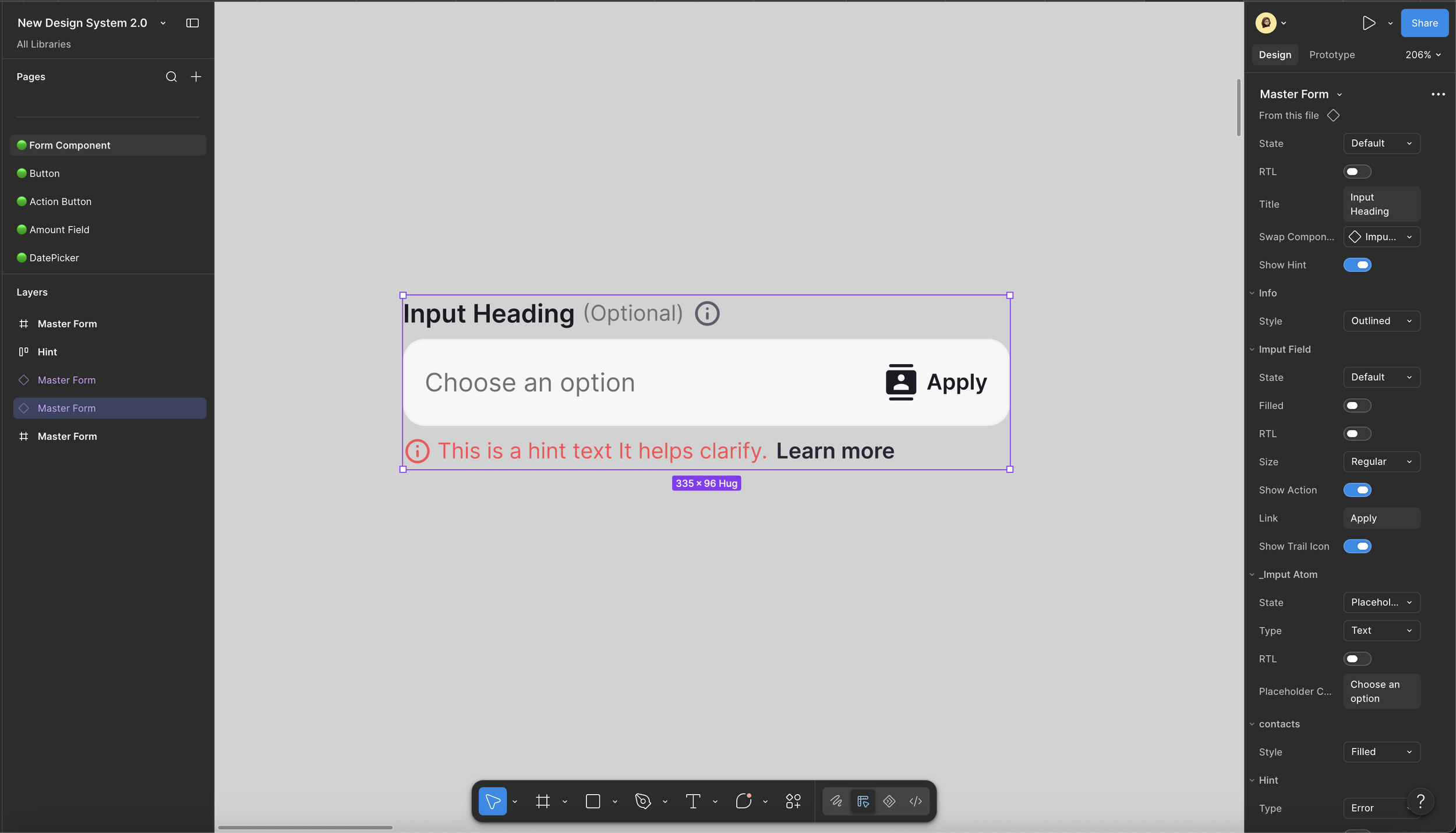
One Master Component, Many Forms
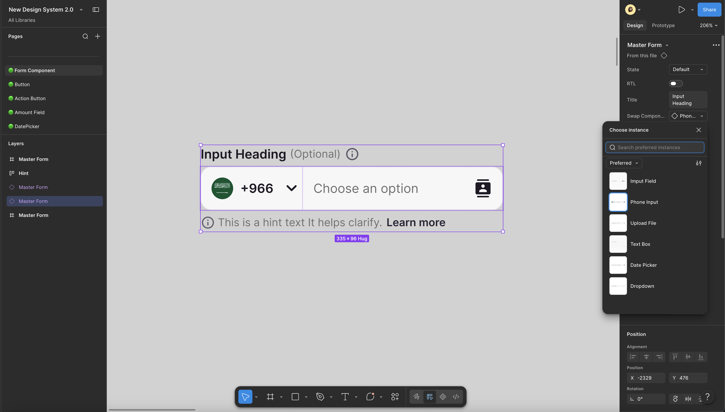
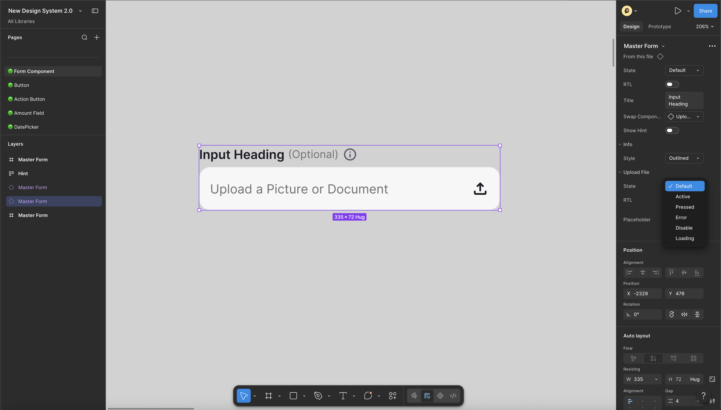
Instead of creating separate components for every scenario, we designed flexible master components.
A single component could support:
Text fields
Phone inputs
File uploads
Dropdowns
Error & success states
RTL
Helper text
One foundation= Many experiences
GovernanceA Design System doesn’t stay healthy on its own.
To keep it reliable, we introduced governance through:
Design standards
Component reviews
Documentation
Weekly Design System Change Log
Version tracking
Shared ownership across the team
Every update was reviewed, documented, and communicated so Design, Engineering, and QA stayed aligned.
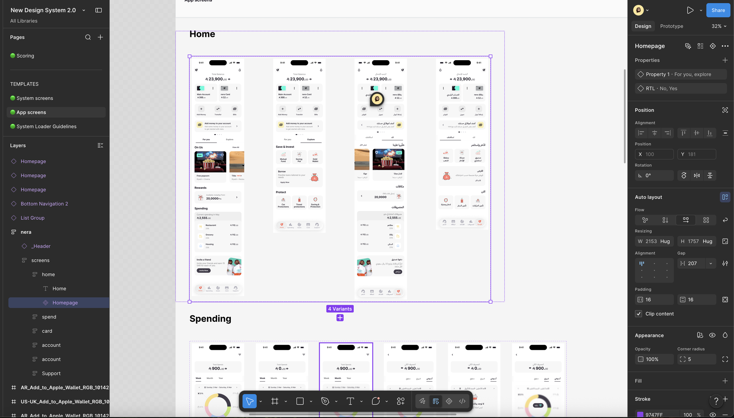
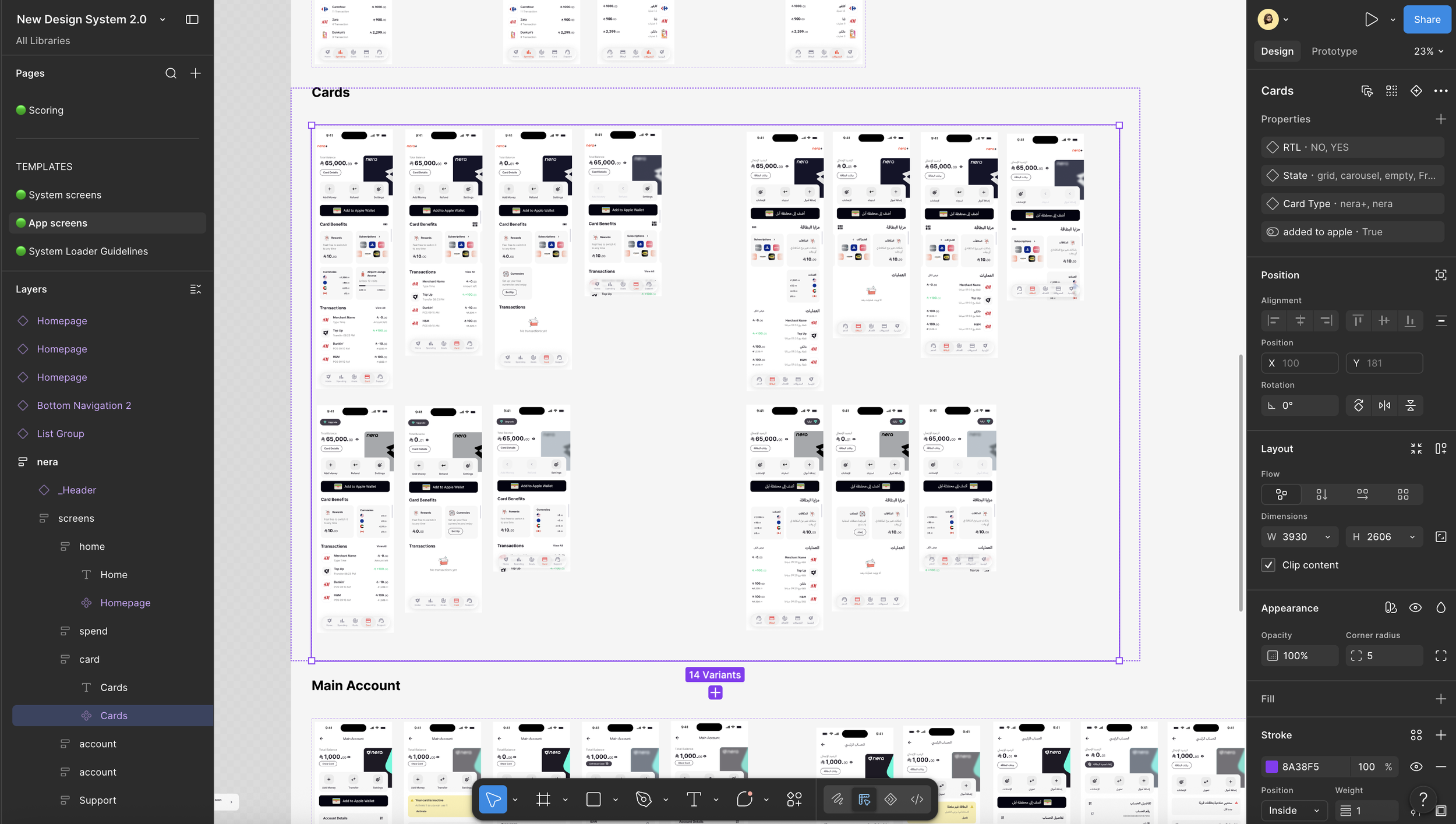
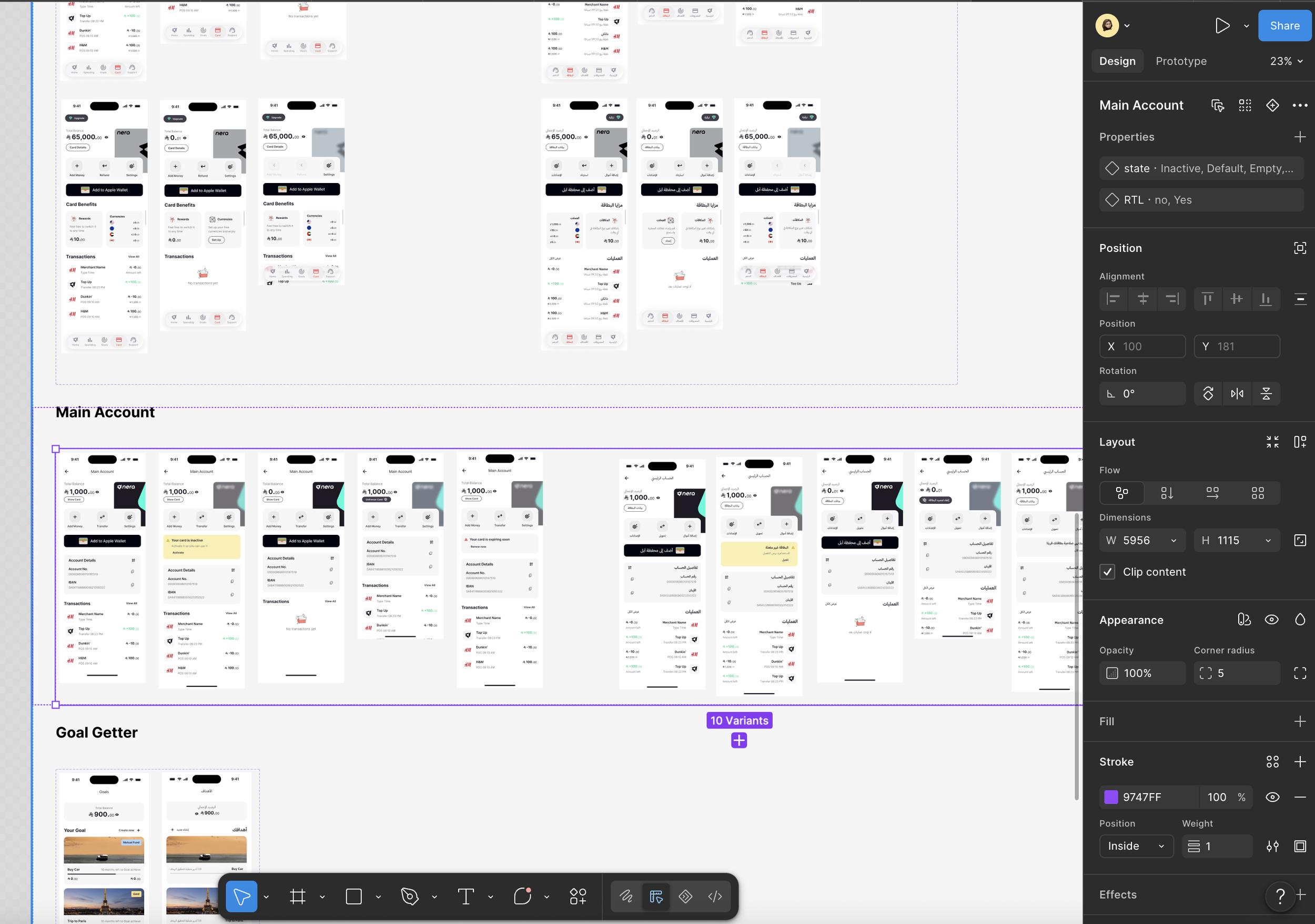
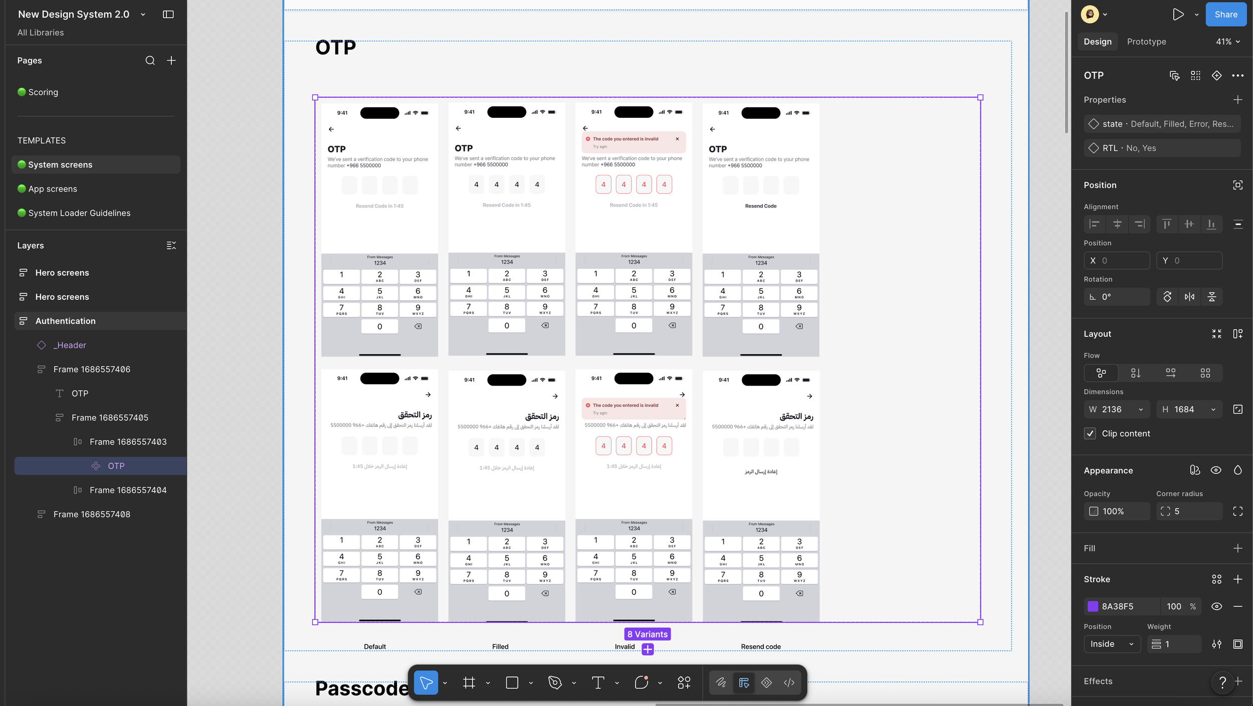
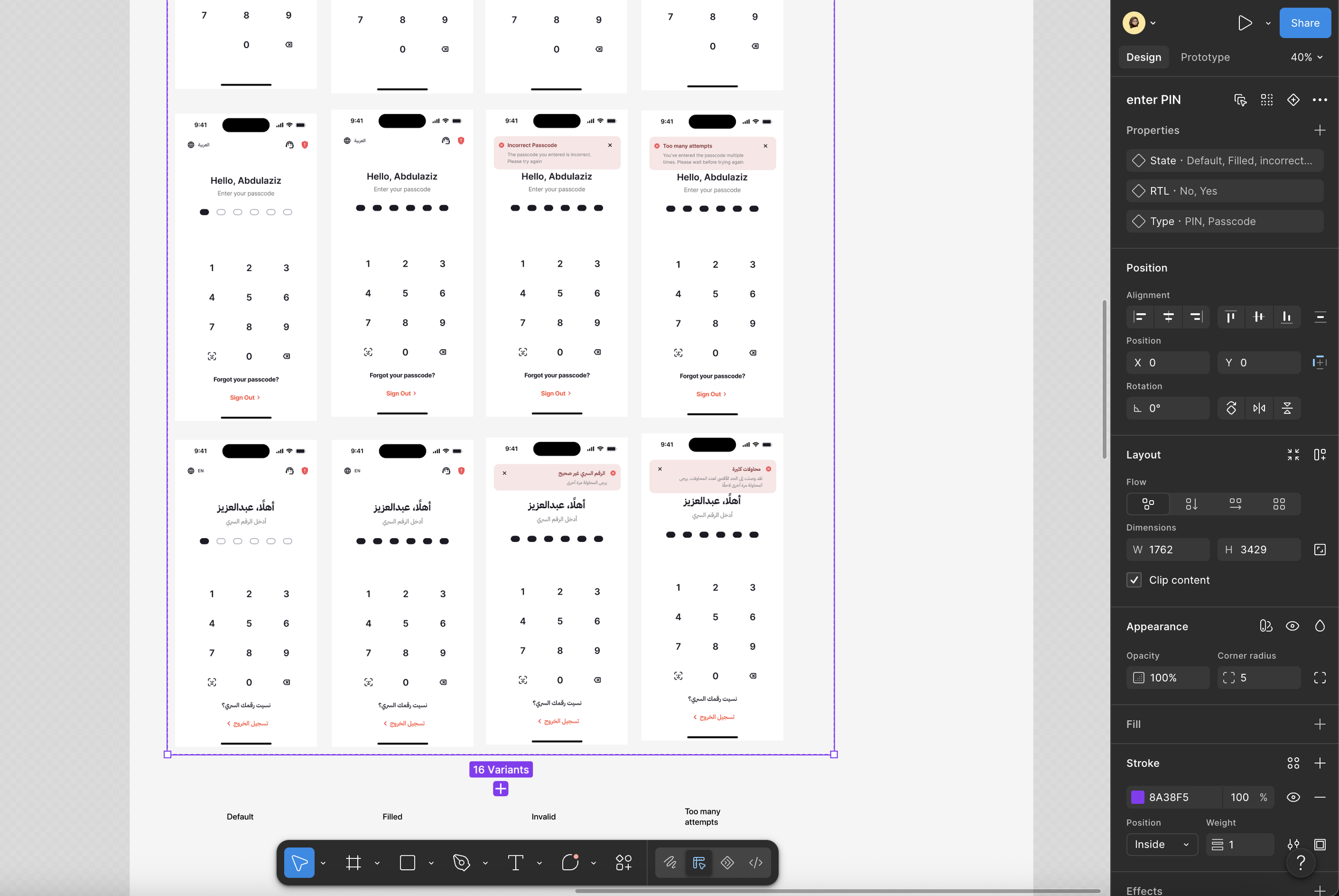
Living Screens
We also brought key product screens into the Design System itself.
Core journeys like Main Account, Cards, and Spending became living references built entirely from reusable components.
Not just as references, but as the source screens feature files pulled from. Update the screen once here, and every file using it updates too, instead of drifting out of sync one copy at a time.
OutcomeThe biggest outcome wasn’t a larger component library.
It was creating one shared language for the team.
Designers worked more consistently.
New team members onboarded faster.
Developers built from predictable components.
Product updates became easier to scale.
The Design System became more than a Figma library - it became the foundation that supported the product’s growth.
What I learnedBuilding a Design System taught me that scalability isn’t about creating more components- it’s about creating better systems.
The real challenge wasn’t designing UI. It was designing a foundation that teams could confidently build on as the product evolved.