Derayah Financial App Audit
A self-initiated exploration of how an investment platform could be better support different type of investors
Why Derayah Derayah is one of Saudi Arabia's leading investment platforms, offering retail investors access to local and global markets.
As a self-initiated design challenge, I chose Derayah because investment apps represent one of the hardest UX problems to solve, they serve users with vastly different levels of financial literacy, carry high stakes decisions, and must balance regulatory complexity with simplicity.
Over a week, I audited the existing app as an outside observer, identified three core experience breakdowns, and explored redesign directions for the home screen - the most critical surface in any trading app.
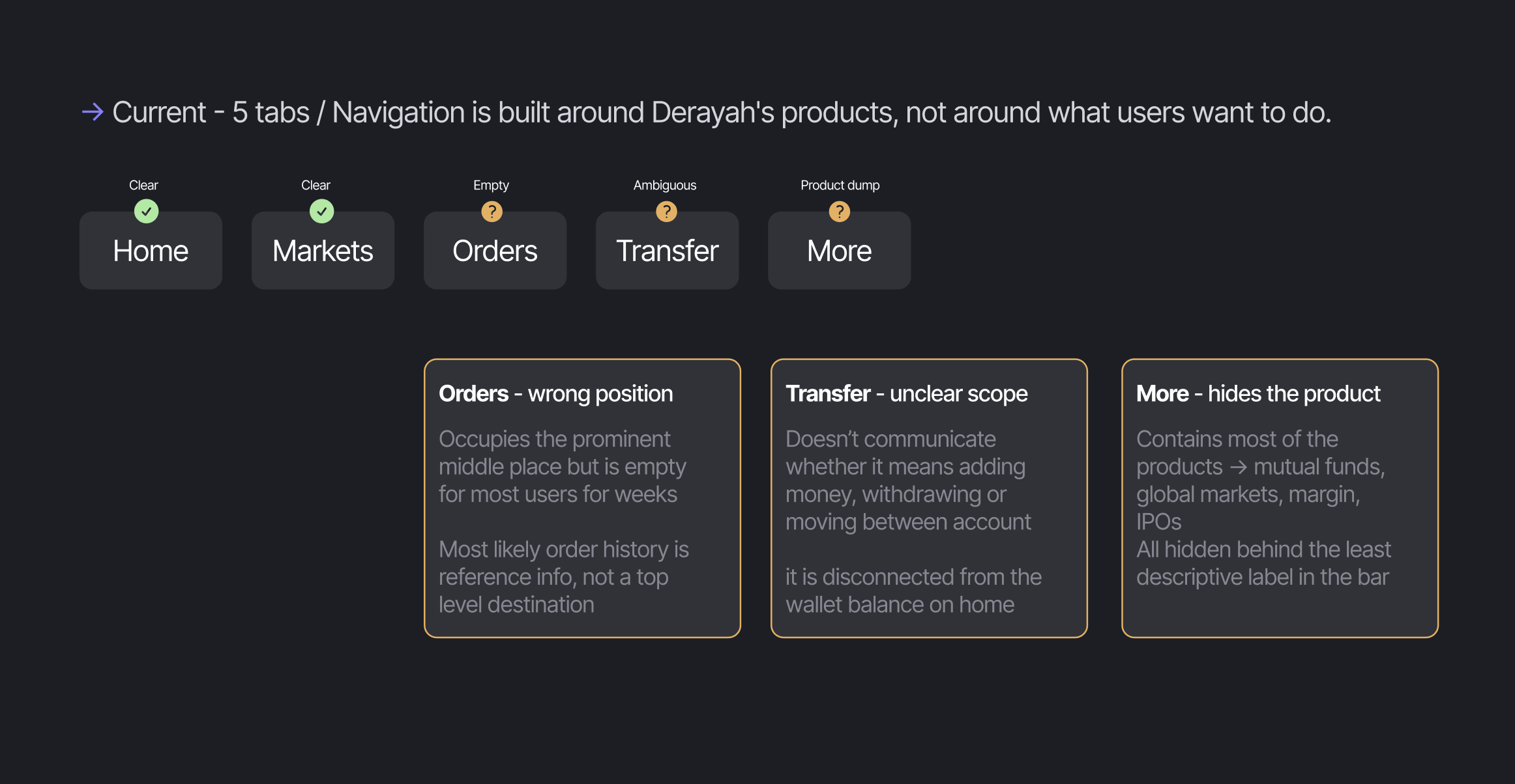
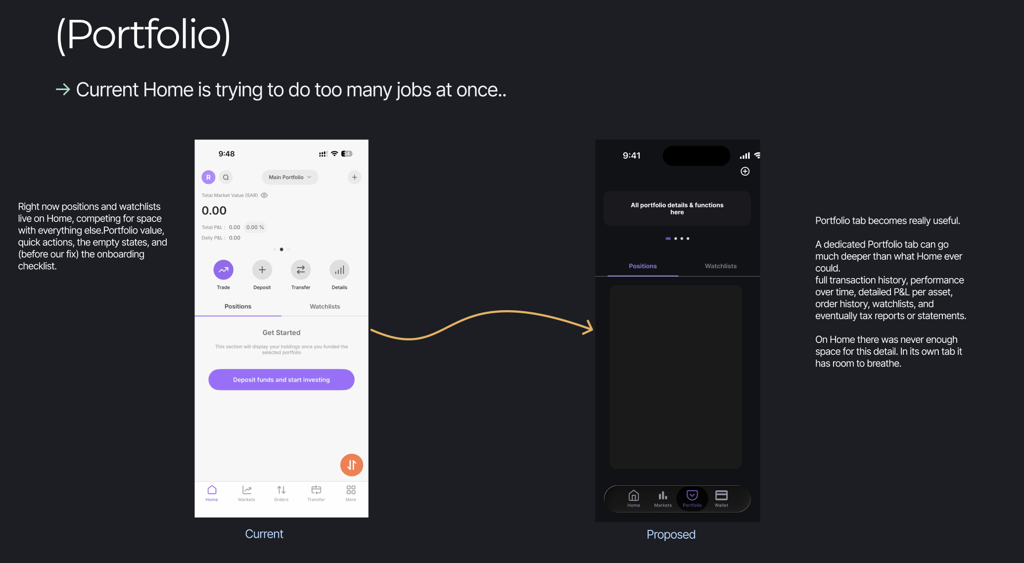
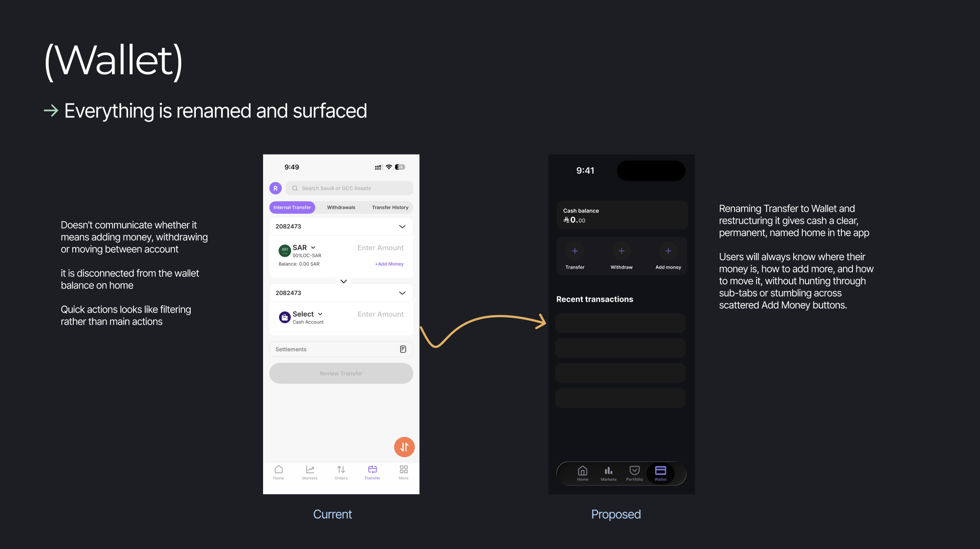
Observation 1: Navigation Navigation bar is organized around the product not the user
Observation 1: Navigation - My RecommendationFour tabs: each with clearer objective
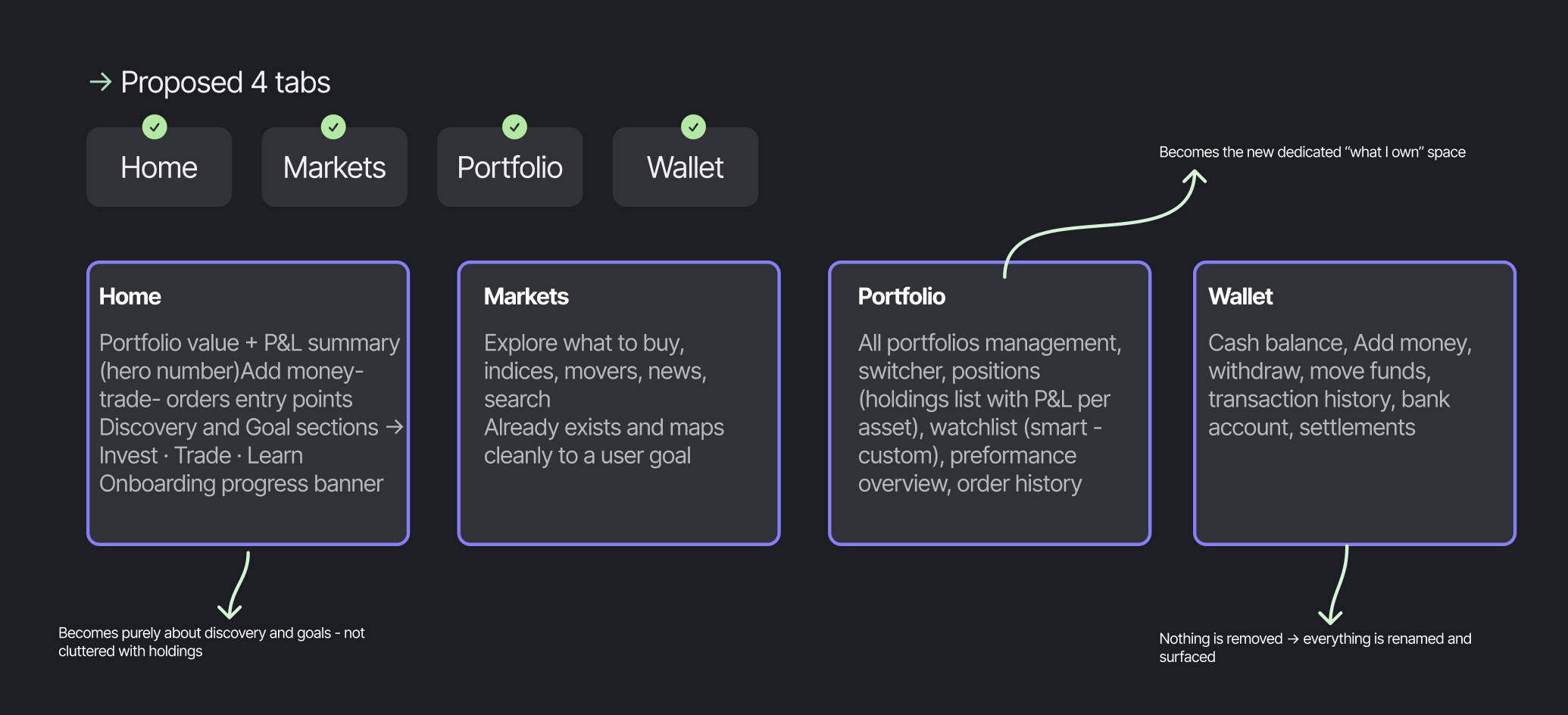
Tabs Overview
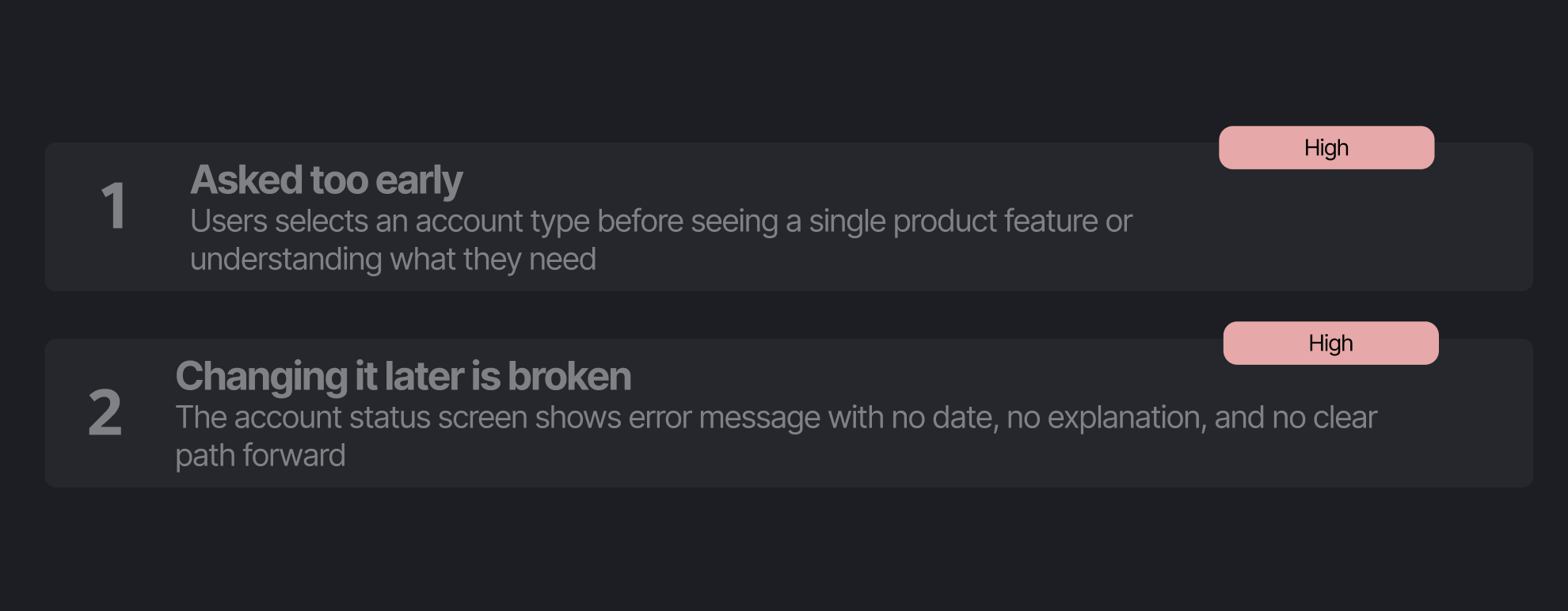
Observation 2: OnboardingLite/Pro asked too early, and changing it later is broken
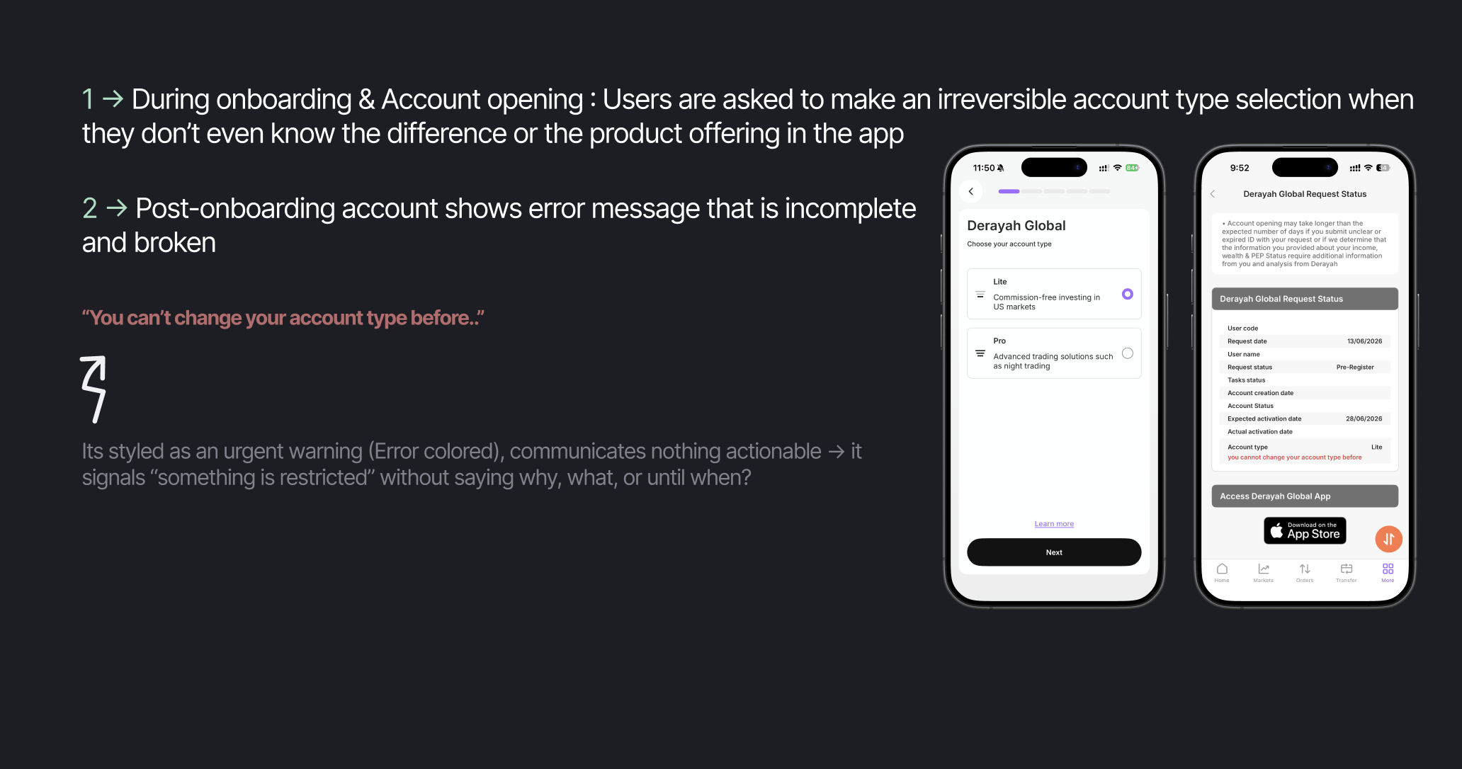
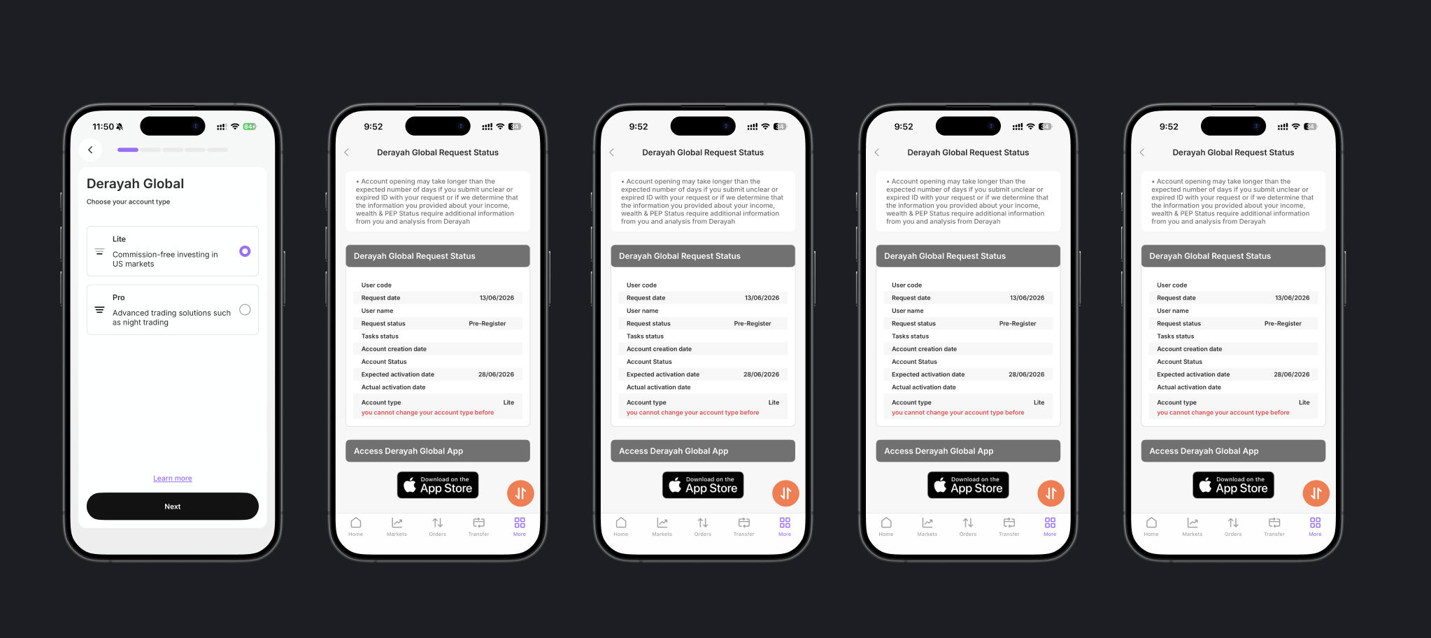
Observation 2: Onboarding - problem statement Forcing users into 1 single path can be frustrating
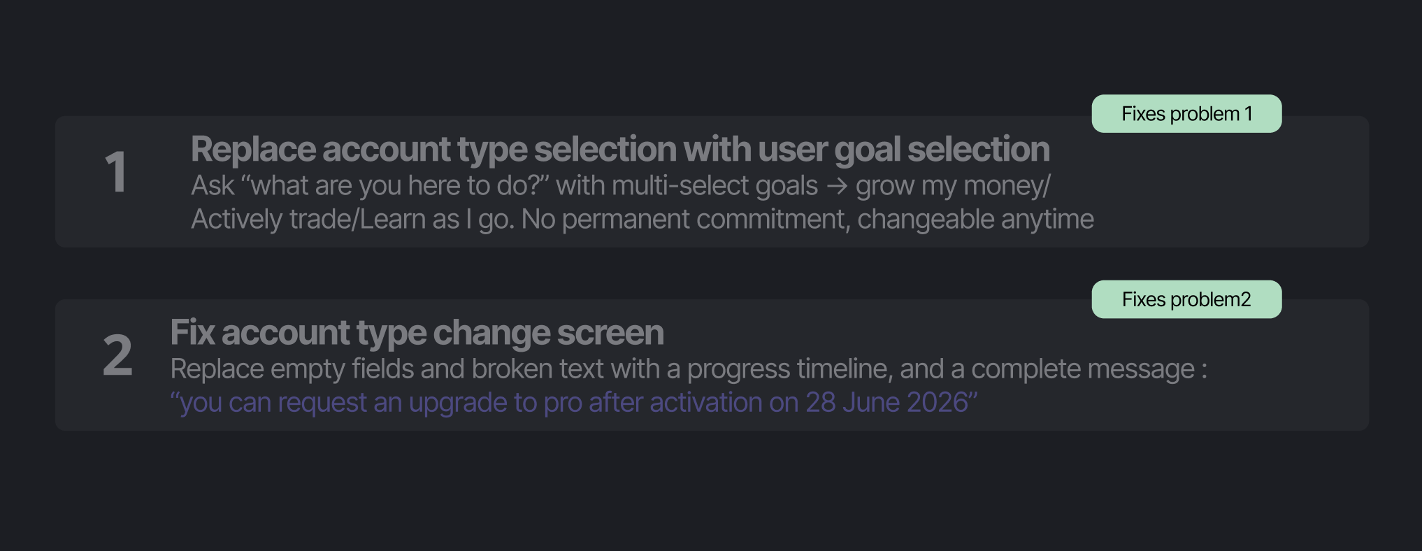
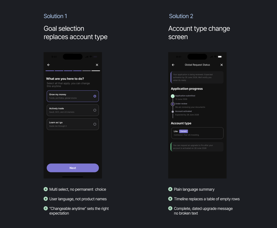
Observation 2: Onboarding - Recommended solutionsRemove Upfront Commitment → Let Users Grow Into The Product
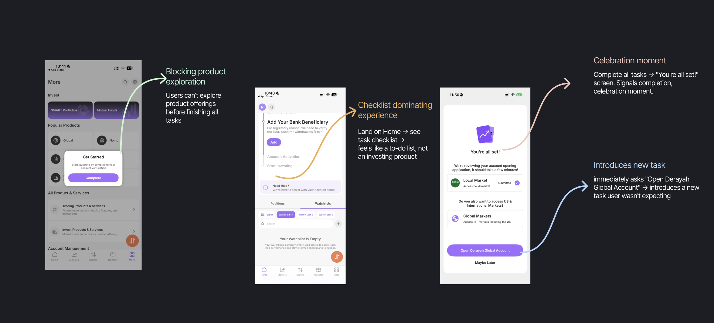
Observation 3: Post Onboarding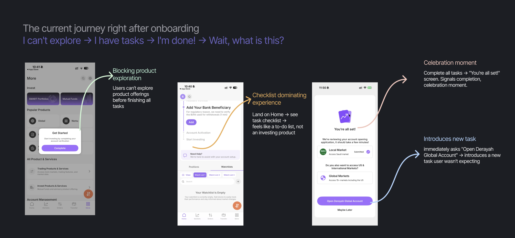
Observation 3: Post Onboarding - Recommended Solution 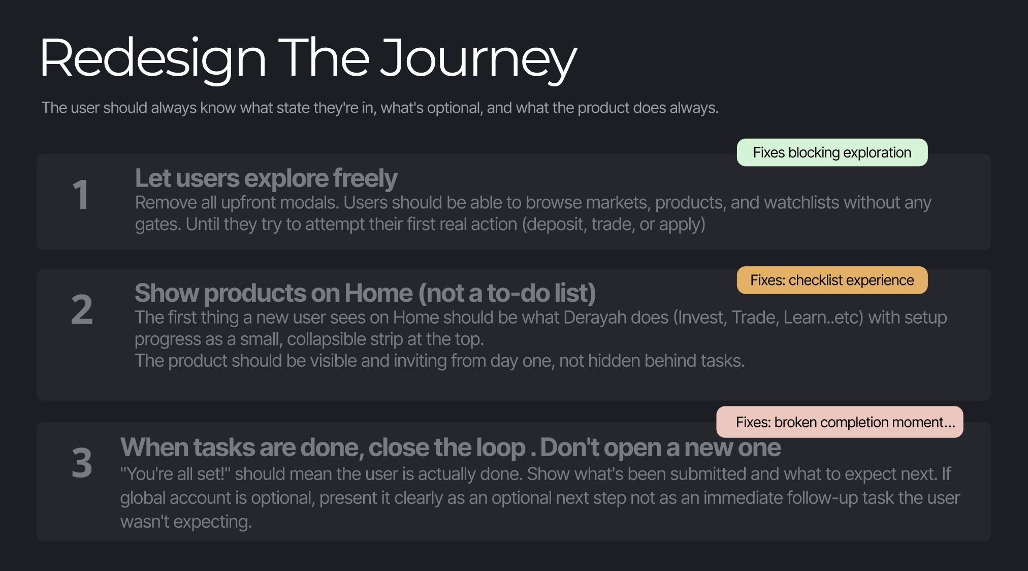
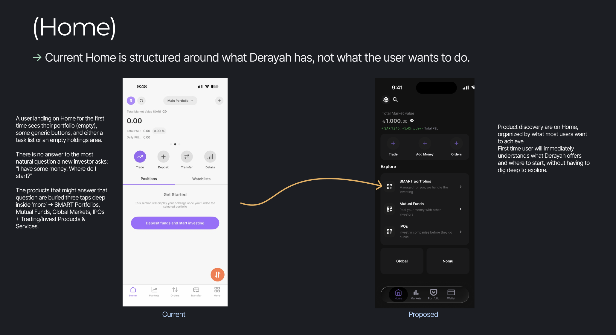
Homepage Exploration (Lo-fi Designs)
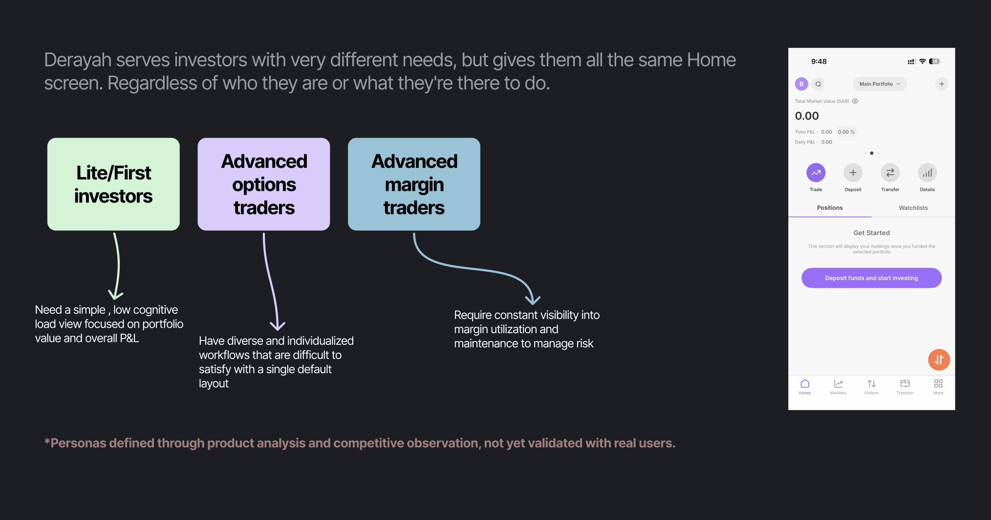
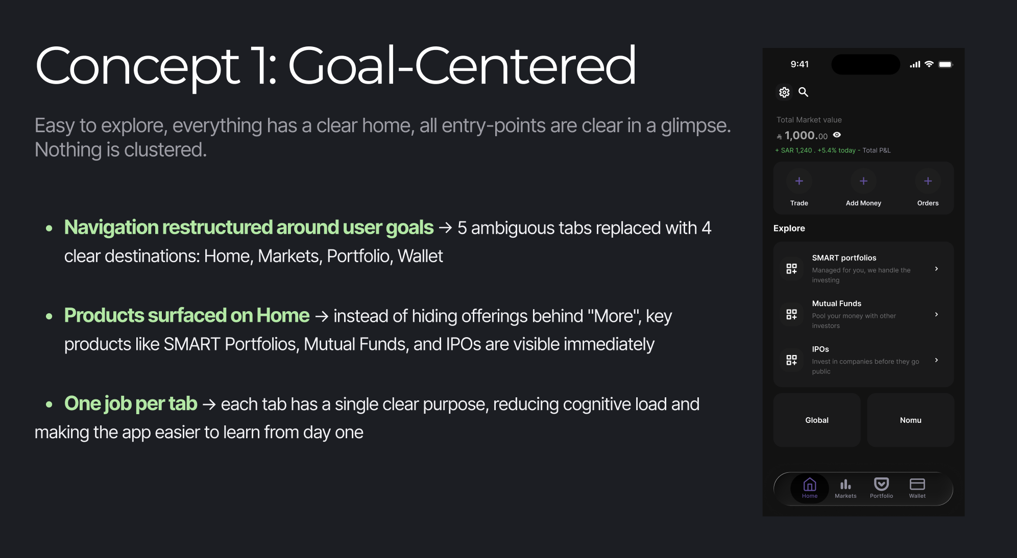
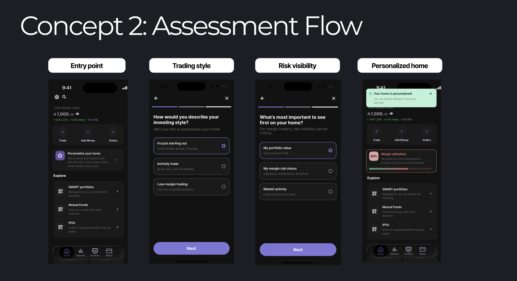
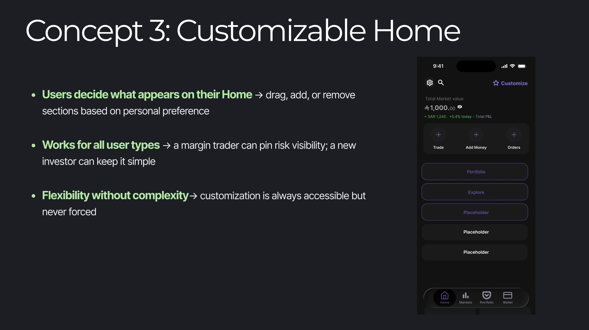
Recommended DirectionOf the three concepts, the Assessment Flow best addresses the root problem: Derayah currently assumes all users want the same experience. Concept 2 flips this by inviting users to personalize their home on their own terms, it's optional, non-disruptive, and can be skipped or changed at any time.
Rather than forcing a decision upfront or building a rigid layout, it gives users control and lets the product adapt to them. This approach respects the diversity of Derayah's user base, from first-time investors to advanced margin traders, without making anyone feel like the app wasn't built for them.
What I'd Do NextThis project was completed in one week as an outside observer, which means the personas and user types identified in this audit are based on product analysis and logical inference rather than real user research.
If taken further, the most important next step would be recruiting and surveying a diverse range of Derayah users → first-time investors, active traders, and margin traders, to validate the assumptions behind the redesign.
Understanding how different personas actually navigate the app, what they prioritize on their home screen, and where they feel most confused would either strengthen the proposed direction or reveal blind spots that aren't visible from the outside. The Assessment Flow concept in particular depends heavily on getting the goal-selection options right, and only real users can tell us if those options reflect how they actually think about investing.