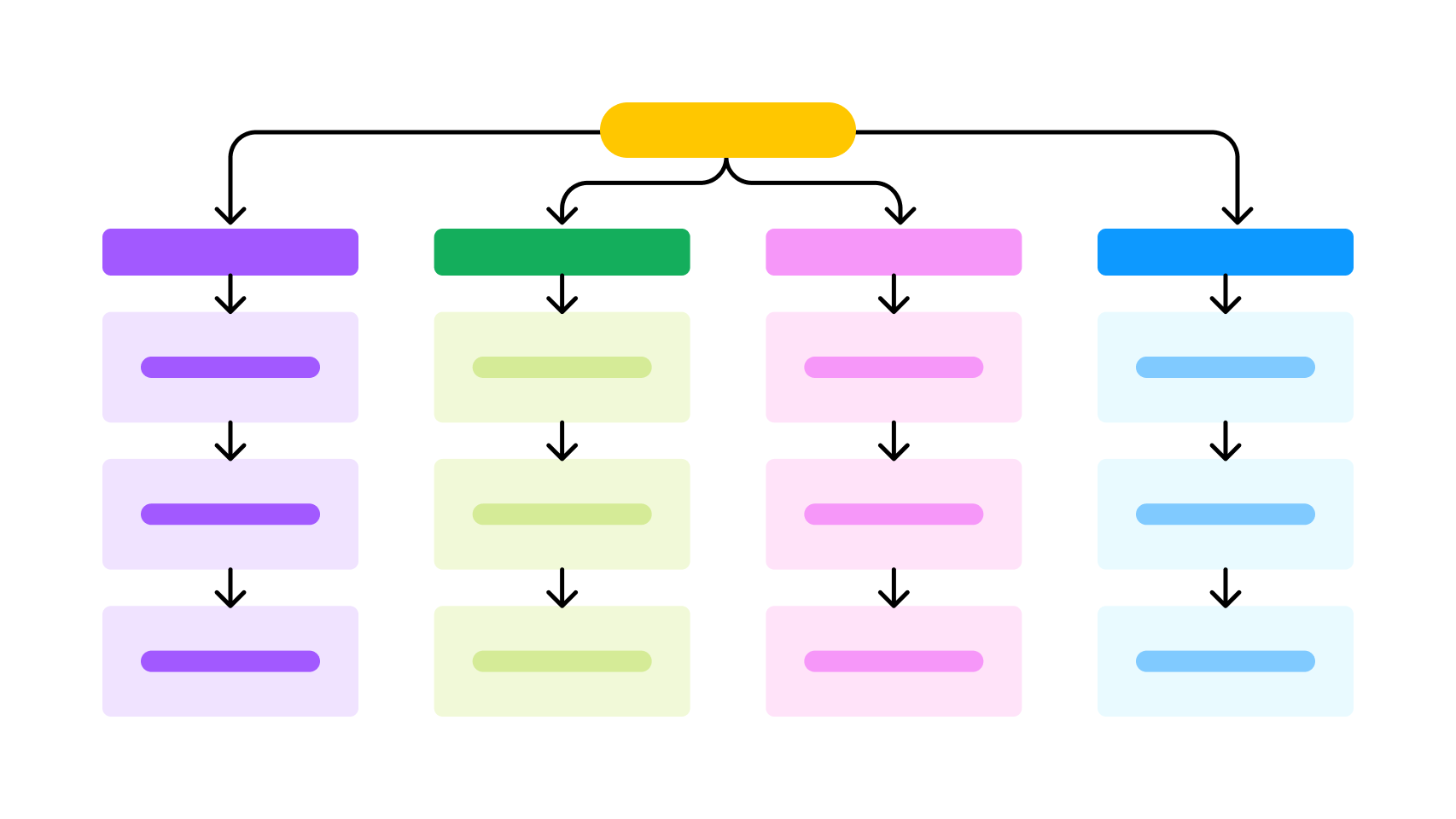
Information Architecture Revamp
Turning a growing content ecosystem into a structure travelers could actually navigate.
BriefAs Visit Saudi expanded, destinations, experiences, attractions, events and travel information were continuously being added to the platform. But the structure underneath the experience hadn’t evolved at the same pace.
Content and entry points was scattered across overlapping categories, similar pages competed with each other, and users didn’t always know where to look for the information they needed.
I worked on rethinking the information architecture across the Visit Saudi web and app - from understanding how people searched for travel information to defining the navigation, categories and page hierarchy.
I led the hands-on research, analysis, and design work → using FullStory to study real user sessions and Maze for card sorting, tree testing, and validating the new structure - with my manager reviewing findings and approach at each stage.
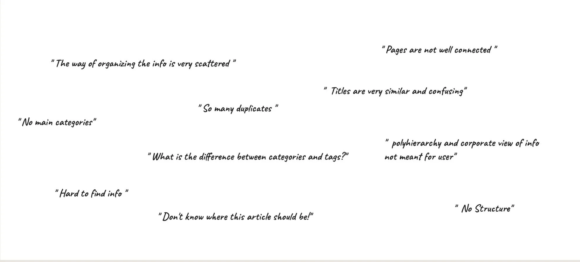
Framing the problemThe issue wasn’t a lack of content. It was how that content was organized and connected.
Our early analysis surfaced recurring problems:
Similar and duplicate content existed across the platform
Categories and tags weren’t clearly differentiated
Some pages were difficult to discover
Navigation reflected internal structures more than user expectations
Related content wasn’t always connected
Users had to move through unnecessary levels to reach useful information
This was making the platform harder to browse, especially for tourists who didn’t yet know exactly what they were looking for.
Setting the GoalCreate an information architecture that made Visit Saudi easier to explore, understand and navigate, while building a structure that could continue to scale as the platform grew.
01 - Understanding how people navigate Before changing the structure, we wanted to understand how people were already moving through it.
Journey & behavioral analysis
I analyzed user sessions, navigation paths and heatmaps to understand:
Where do users enter?
Where do they go next?
Where do they struggle?
And where do they abandon or repeatedly interact?
Looking at real journeys helped reveal gaps that weren’t obvious when reviewing individual screens.
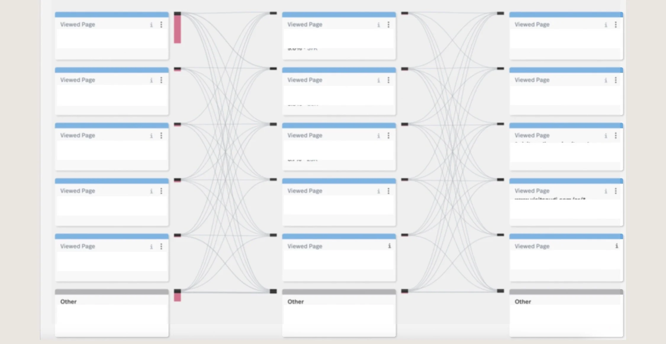
Session Analysis (FullStory)
Studied real user journeys and session recordings to understand how people were actually moving through the app with heatmap data to spot friction points like rage clicks.
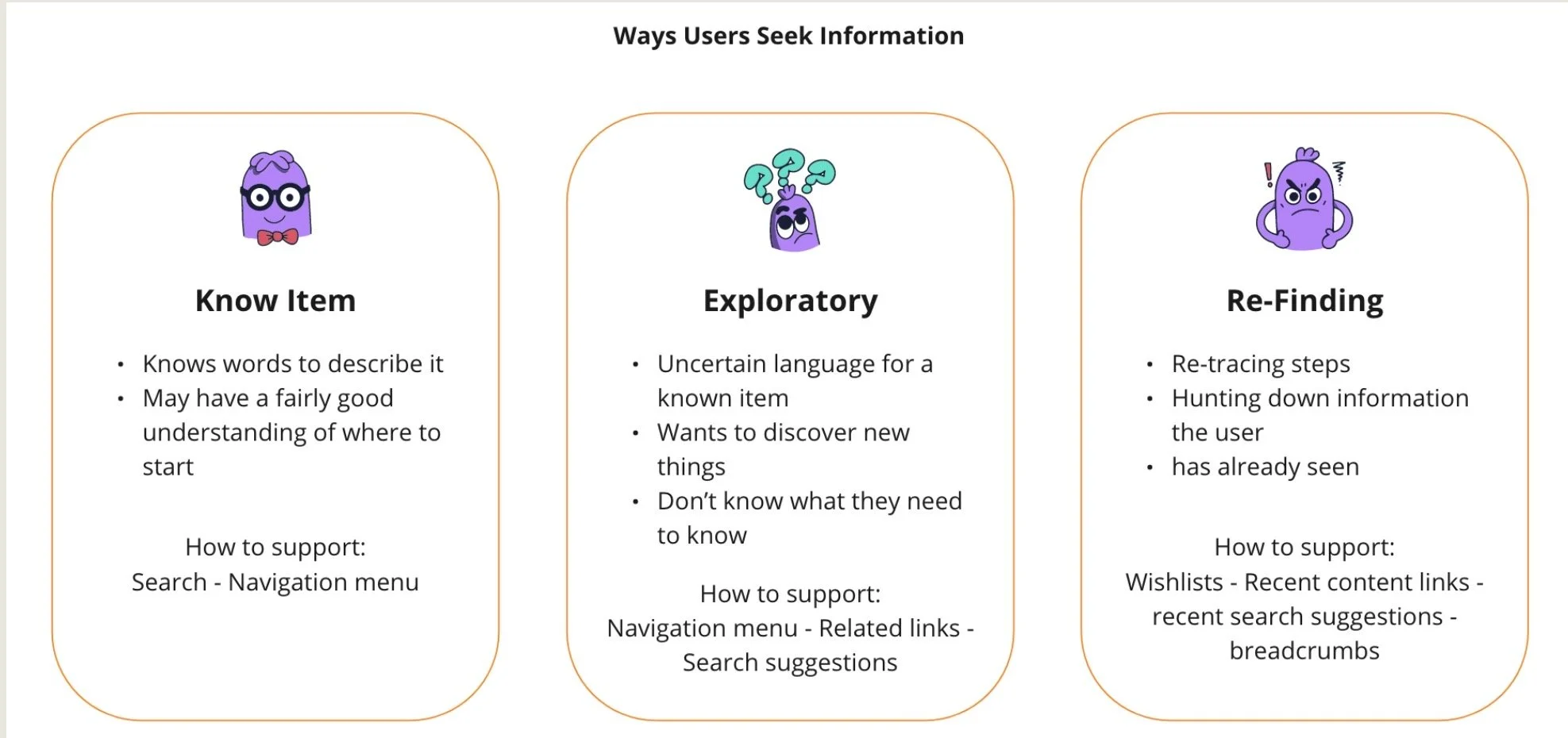
02 - Understanding how travelers seek informationNot every traveler arrives with the same intent.
Through desk research and behavioral analysis, I looked at different information-seeking patterns - from users who know exactly what they want, to those who are simply exploring Saudi and looking for inspiration.
That distinction became important because Visit Saudi needed to support both finding and discovery.
An international traveler researching Saudi for the first time, for example, needed a very different entry point from a domestic traveler looking for something to do this weekend.
Desk Research
Sources: Information Architecture on the World Wide Web, Peter Morville and Lou Rosenfeld Practical information Architecture, Donna Spencer
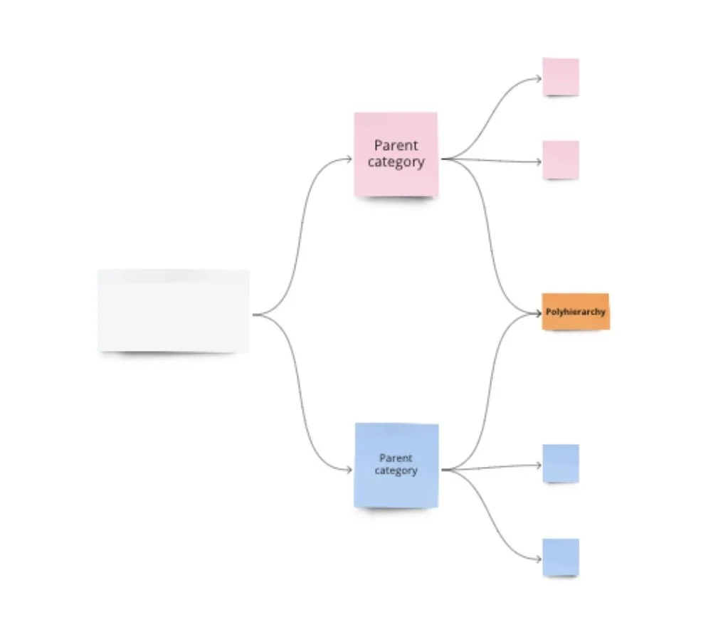
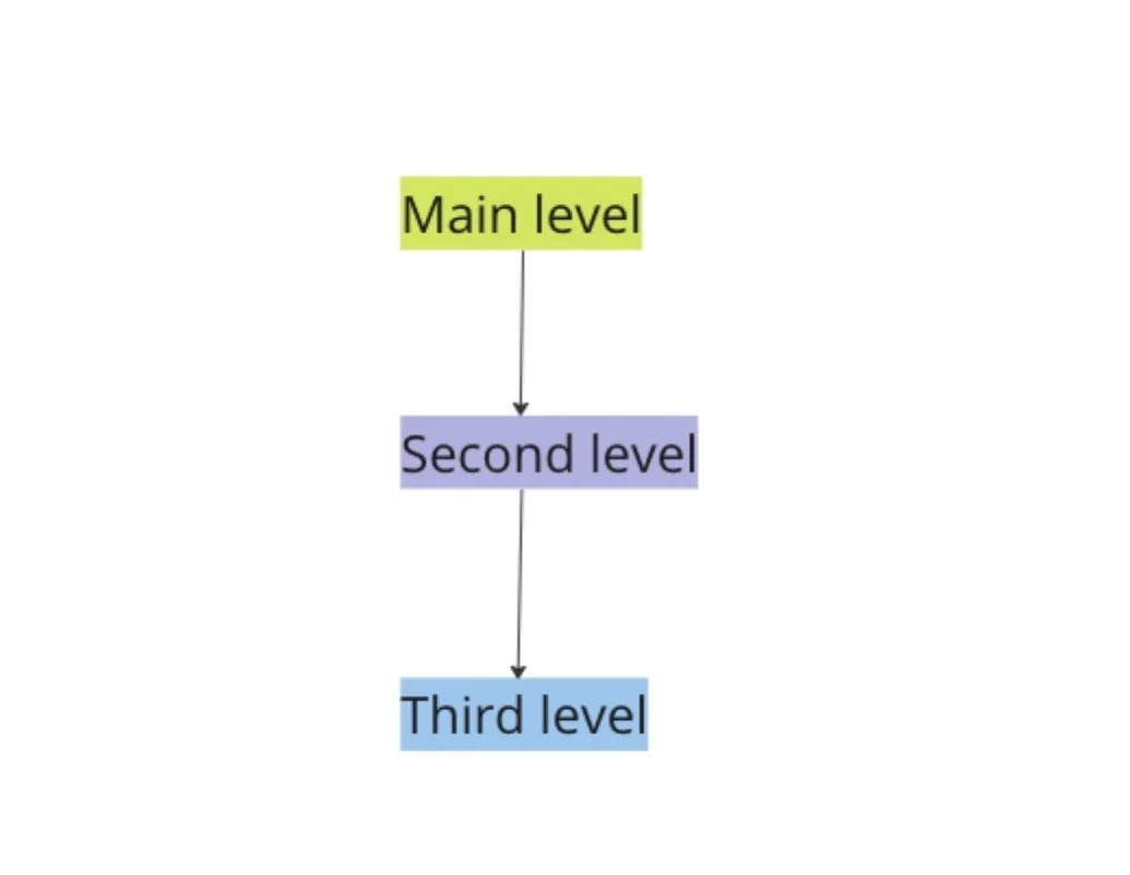
Exploring the right hirerachy As part of the desk research, I explored different hierarchy models to understand which structure would best support Visit Saudi’s large and diverse content ecosystem.
Narrow & Deep: Reduced the number of choices at each level, but required users to navigate through too many layers to reach content
Broad & shallow: Made more content immediately visible, but risked overwhelming users with too many categories at once
Poly-hierarchy: Allowed relevant content to exist within more than one context. Useful for tourism where the same experience could naturally belong to multiple journeys or categories
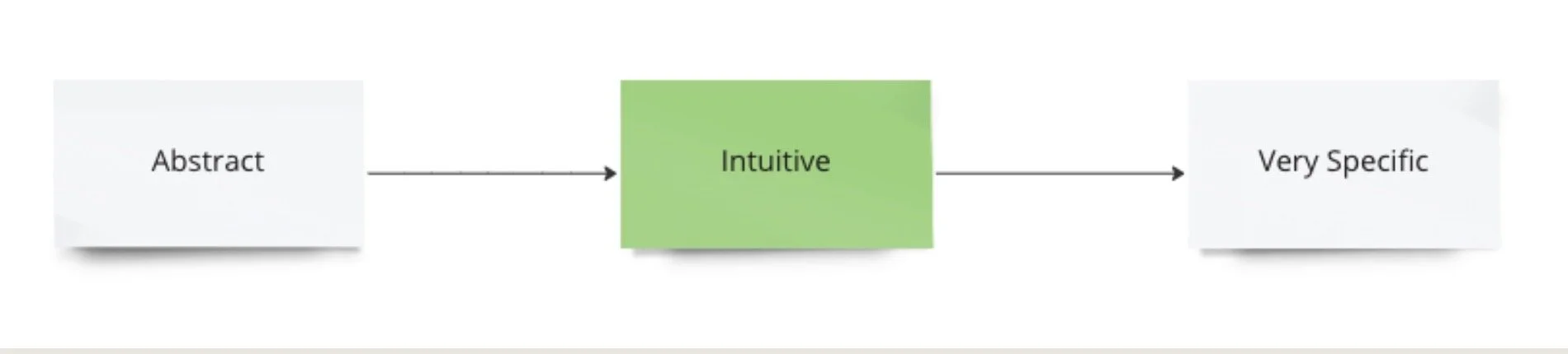
Conceptual & Poly-hirerachy
03 - Auditing the ecosystem Before proposing a new structure, I mapped the existing website and its content relationships.
Content inventory & audit
The audit exposed how complex the ecosystem had become.
It helped us identify:
Duplicate content · overlapping categories · disconnected pages · inconsistent labeling · unnecessary hierarchy
Rather than redesigning individual pages in isolation, this gave us a view of the platform as one connected system.
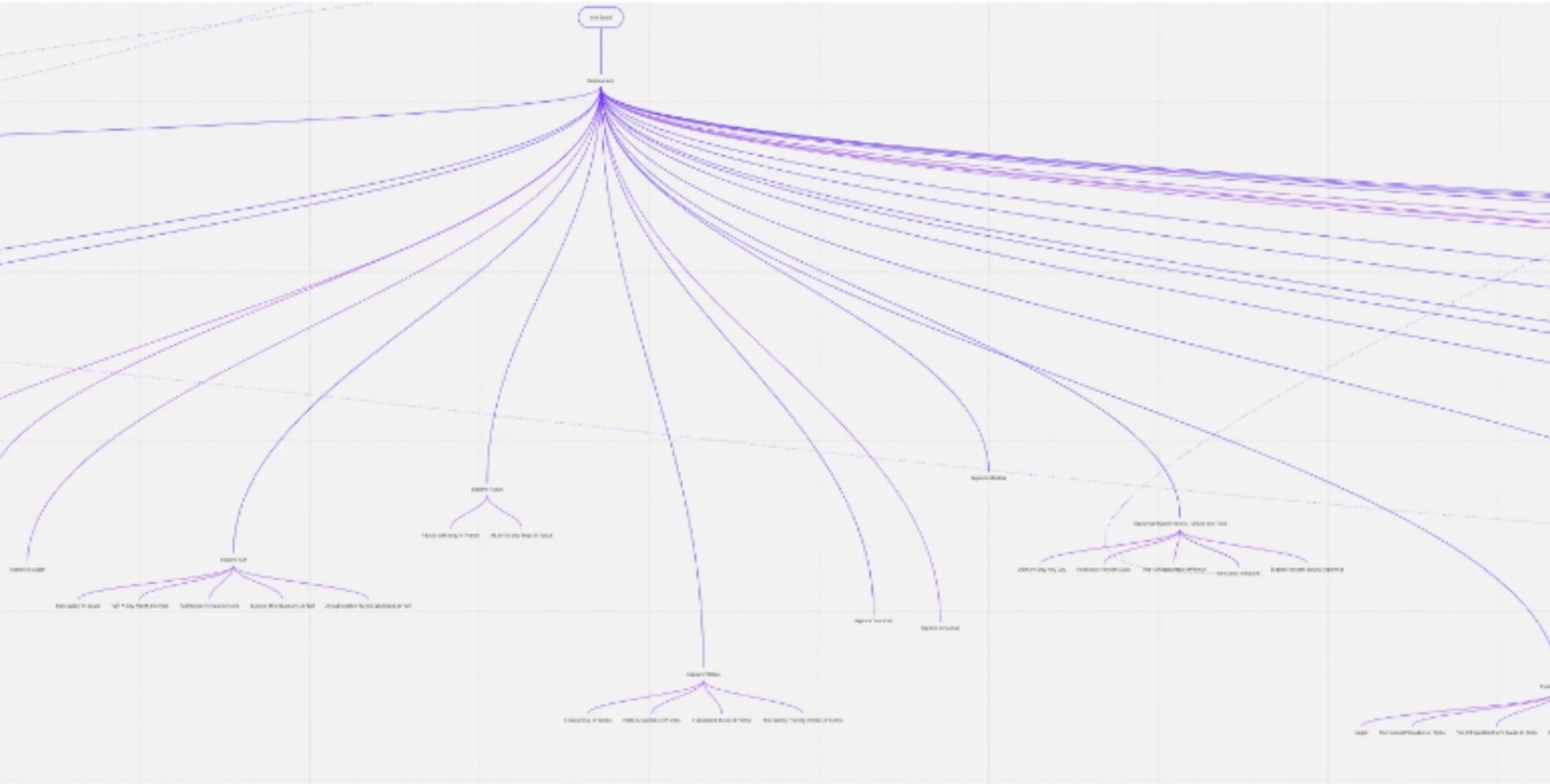
Web Inventory & Audit
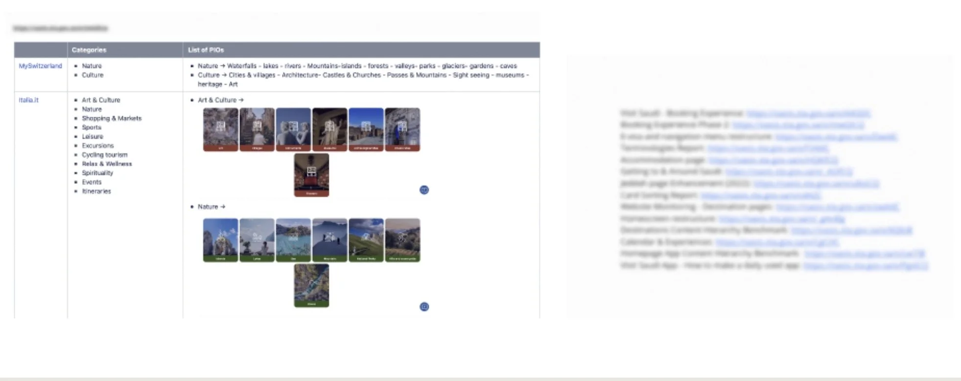
04 - Learning from other tourism platforms I benchmarked tourism and travel platforms to understand how other ecosystems handled large amounts of destination and experience content.
The objective wasn’t to copy their navigation.
It was to understand common mental models: how destinations, things to do, trip planning and supporting travel information were grouped and surfaced.
Competitive Benchmark
05 - Letting users define the categories One of the biggest questions was:
How would travelers naturally group Visit Saudi’s content?
Instead of defining the taxonomy internally, we tested it with real users.
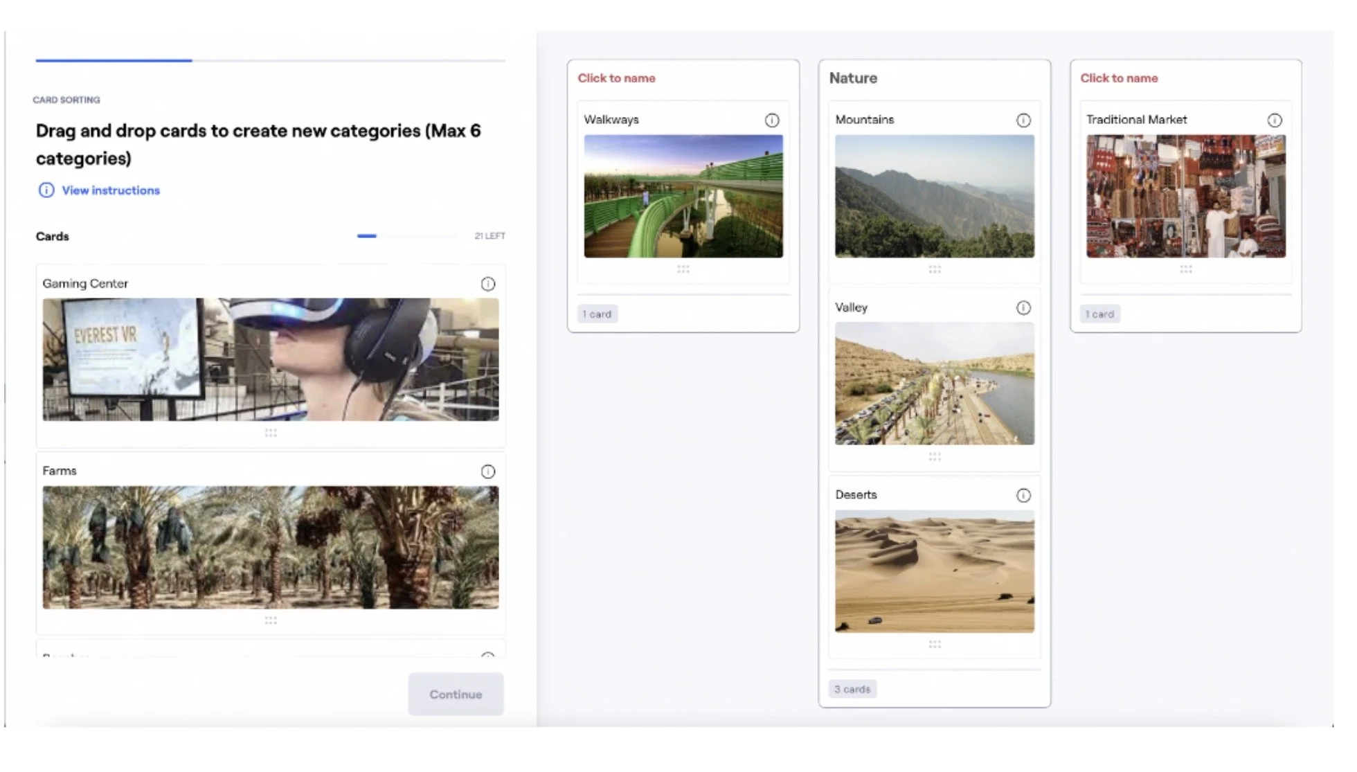
Card sorting
Participants grouped different types of points of interest and created labels that made sense to them.
The study included participants across:
Saudi Arabia · UAE · US · UK · China · India
I analyzed the results using similarity and agreement matrices to identify patterns in how users associated different types of content.
These patterns helped inform both the main categories and the relationships between them.
Card Sorting
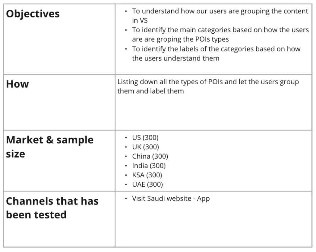
Test details
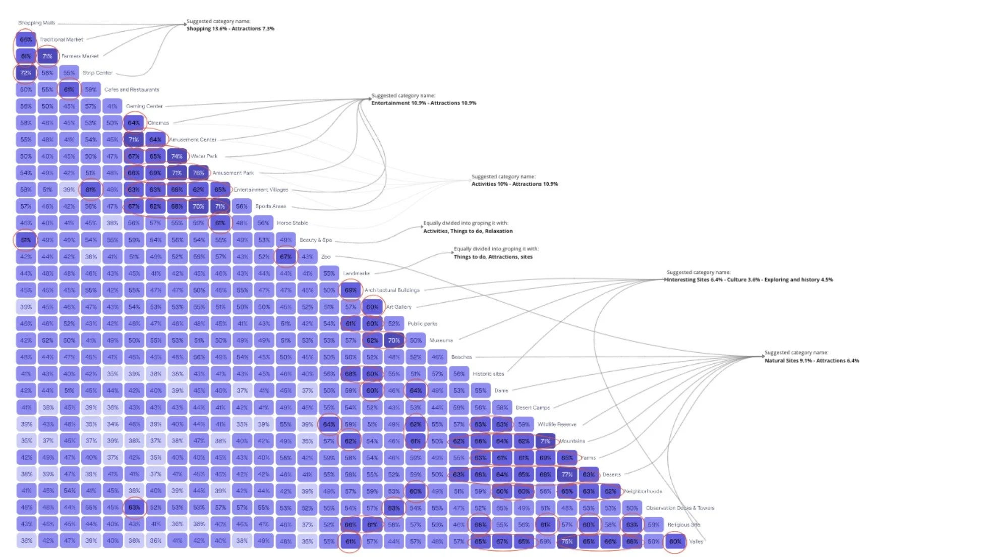
Similarity & Agreement Matrix
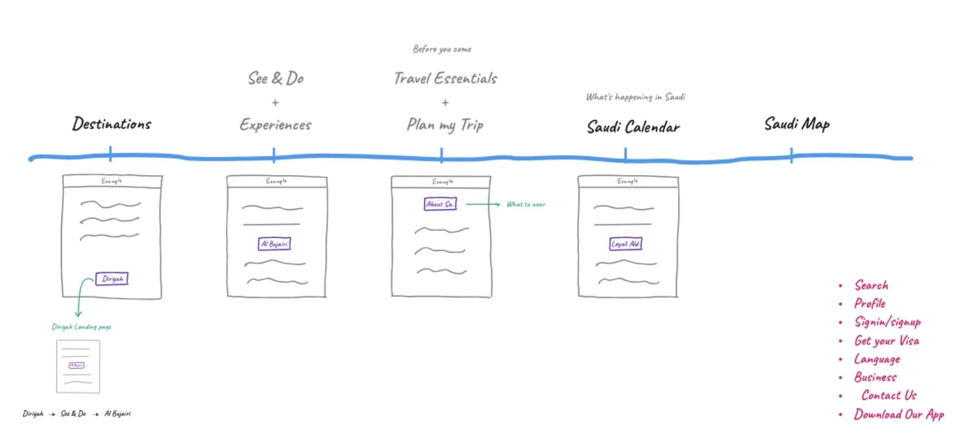
06 - Designing the new structureThe research gave us a clearer model for organizing the experience.
Instead of allowing the platform to keep growing through disconnected categories, we created a more deliberate hierarchy around the traveler’s journey.
The new high-level navigation brought the experience together around areas such as:
Destinations
Explore Saudi by place.
See & Do
Discover experiences and things to do.
Plan My Trip
Move from inspiration into practical trip planning.
Saudi Calendar
Discover what’s happening and when.
Supporting tools such as search and maps helped users move across these structures without relying entirely on hierarchical navigation.
High-level Navigation menu
07 - Designing for different traveler needsThe hierarchy also informed how content was prioritized within pages.
International visitors often needed inspiration, context and trust before making decisions.
Domestic users were more likely to arrive looking for what’s new, what they could do, or how to book.
Instead of forcing both audiences through exactly the same experience, we explored how the hierarchy and homepage could better respond to those different needs.
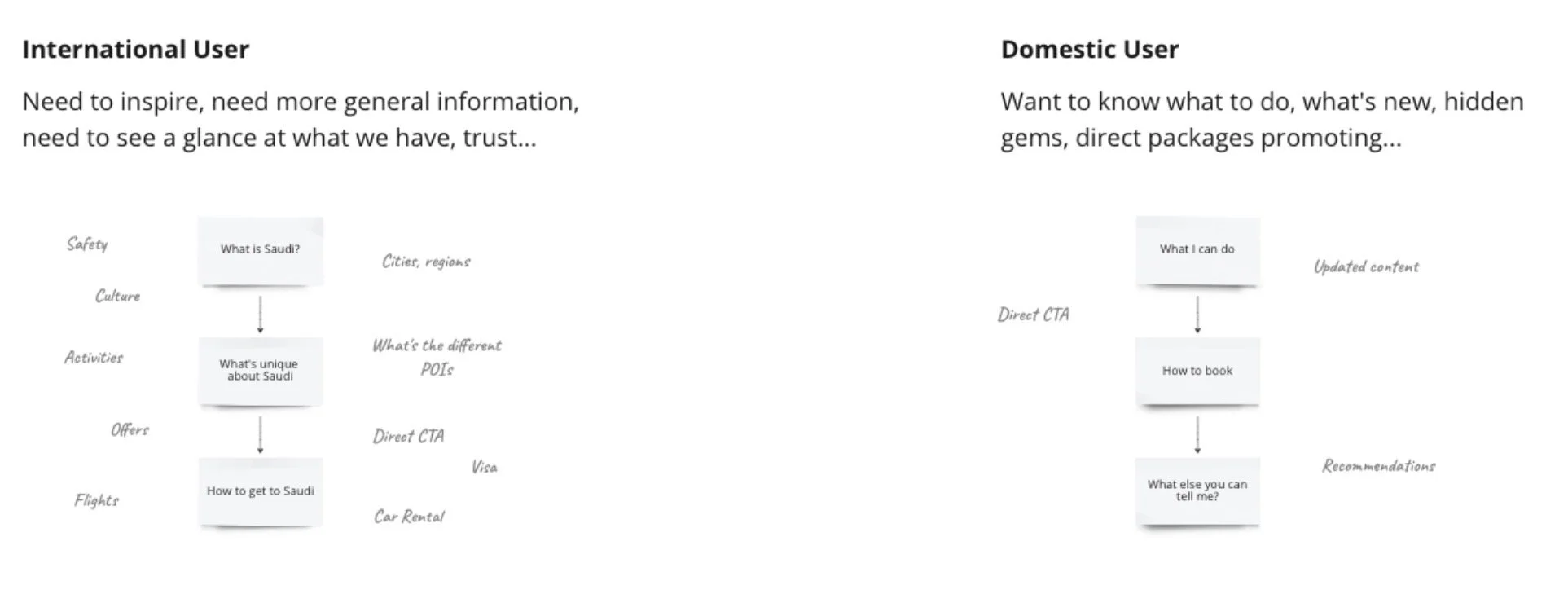
Domestic vs International
08 - Validating the architectureA structure that looks logical on a diagram doesn’t necessarily make sense to users.
So we tested it.
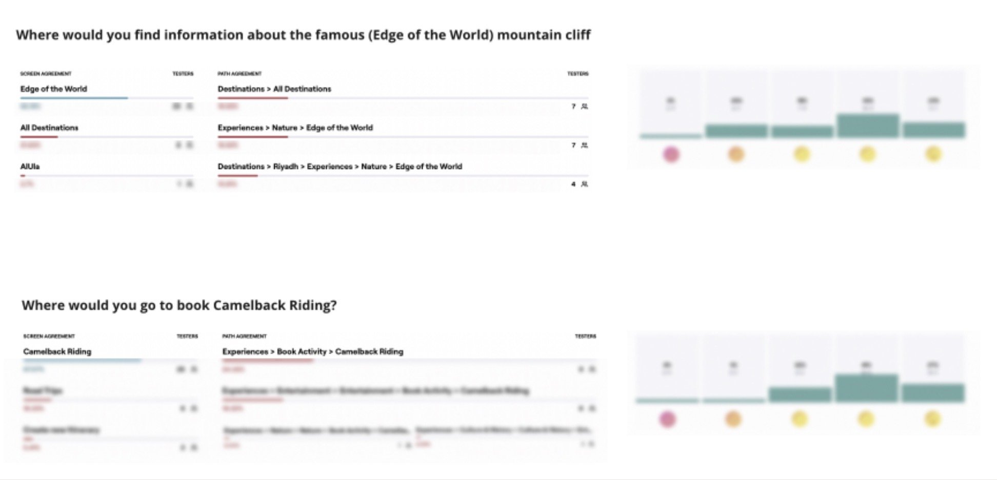
Tree testing
Participants were given real tasks → such as finding information about a specific attraction or figuring out where they would go to book an experience without relying on the visual interface.
This allowed us to evaluate the architecture itself.
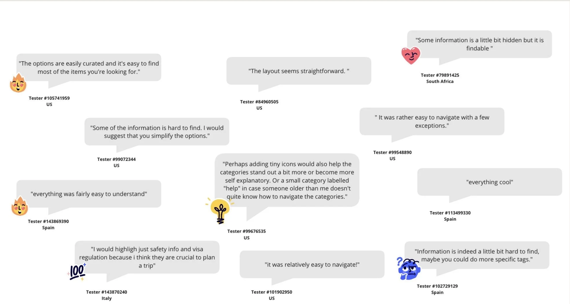
The results helped identify paths that were intuitive as well as categories that still needed clearer naming or placement.
Tree Testing Feedback
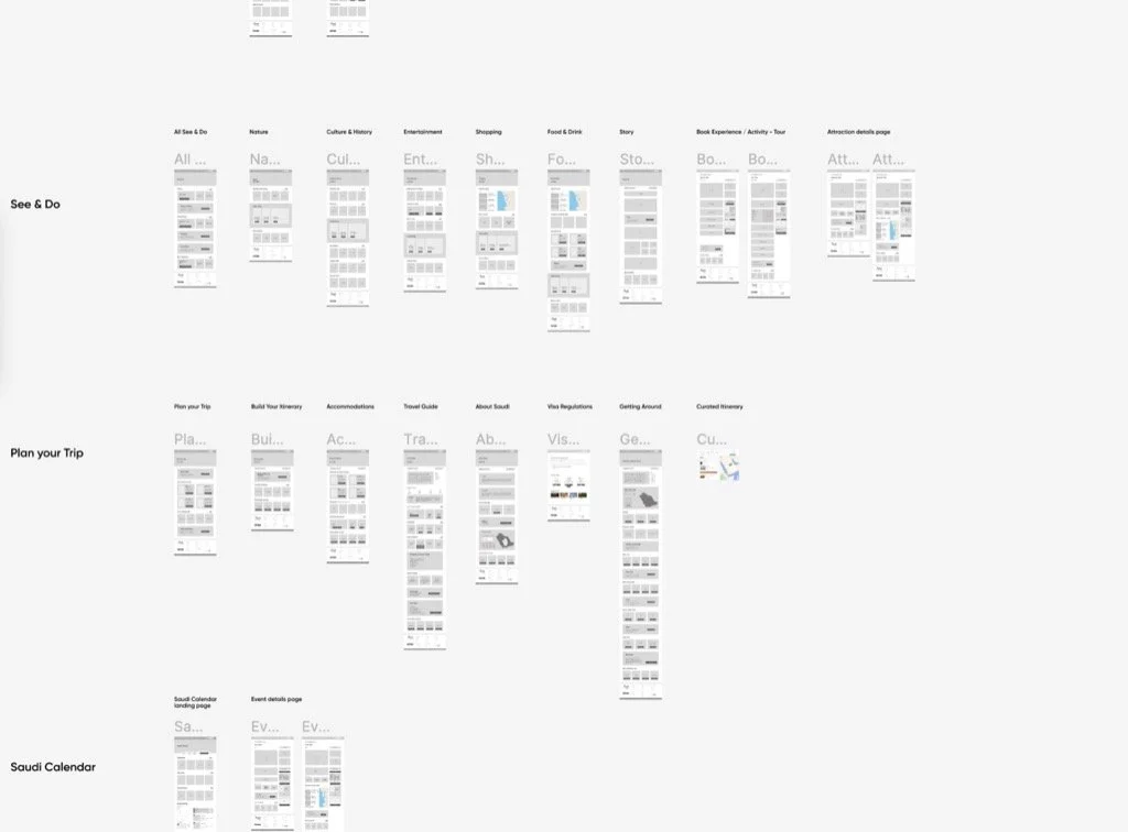
From architecture to experienceOnce the structure was validated, I translated it into page hierarchy, wireframes and content organization across the platform.
The work informed how the homepage, destinations, experiences, trip-planning content and supporting pages connected to one another.
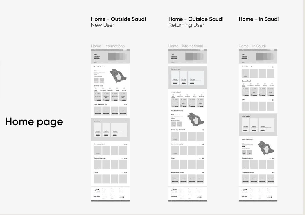
Wireframes & Mockups
What this project taught meThis was one of the projects early in my career that changed how I thought about UX.
I learned that a navigation problem isn’t always solved by redesigning the navigation.
Sometimes the real problem sits much deeper - in taxonomy, content relationships, hierarchy and the assumptions a business makes about how users understand its information.
Working through the ecosystem from behavioral data and research to taxonomy, validation and finally interface design taught me to think beyond individual screens and design the system underneath the experience.