Full Design Systems
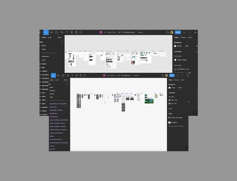
A collection of customizable UI elements, patterns, and standards, created for digital product, with the goal of improving the overall consistency, and quality of the product design experience.
The Challenge
When designing a new project from scratch, it can be nice to be able to start fresh, and design without any constraints, and let the creativity guide.
But with this product, patterns and most components have been already refined and validated. With deadlines approaching, the most challenging part was to make sure each component is easy to maintain and does not diverge with different cases.
Considering all the needs and possible cases when creating components with instances to avoid difficulties in order to be used in the most efficient way to be organized, distributed, coded, and to be expanded to incorporate other features and behaviors within Visit Saudi.
HMW’s
How might we create a single source for all existing components?
How might we ensure quality and consistency across all app?
How might we improve the productivity for designers and developers?
Information Gathering
Our first step to create the design system was to collect and review all style guides, brand identity and guidelines.
Design Approach
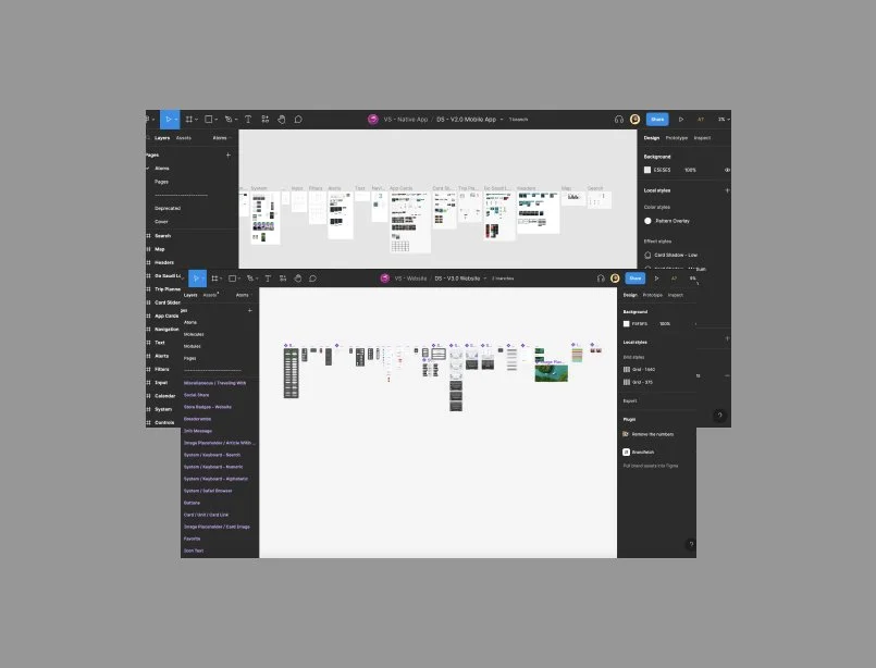
To determine how to approach these issues in the best way, we ran workshops with the team to define the technologies and tools we could use to improve our workflow, grid and breakpoints usage and developer handover process.
We were all aligned to create our design system in Figma, since it will be our main single tool for all UX and UI projects to avoid duplications of file versioning and to be easily shared with different parties.
For the grid, we chose to adopt the column grid in our design system to generate variety of visual layouts : 12 columns grid for desktop ( 1440px ) and 4 columns for mobile screen (375 px) which assisted to create components in a systematic and organized way, positioning texts and graphics in a consistent and easy-to-follow manner.
Shared Design Language
Atomic Design was a familiar concept to everyone in the team, so we decided to start by organizing elements into Atoms, Molecules, Modules, Templates and pages.
We wanted to user test this grouping with product owners and developers to ensure a smooth handover by providing each user with a sheet listing different components and asked where they would expect to find these. We discovered that these categorizations weren't as intuitive as we hoped.
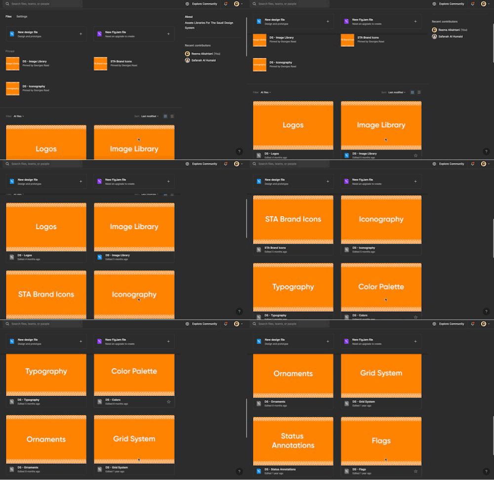
So we decided to go with an alternative grouping system that includes all of the above but with adding more: Typography, Colours, Logos, Icongraphy… and etc.
Component Properties
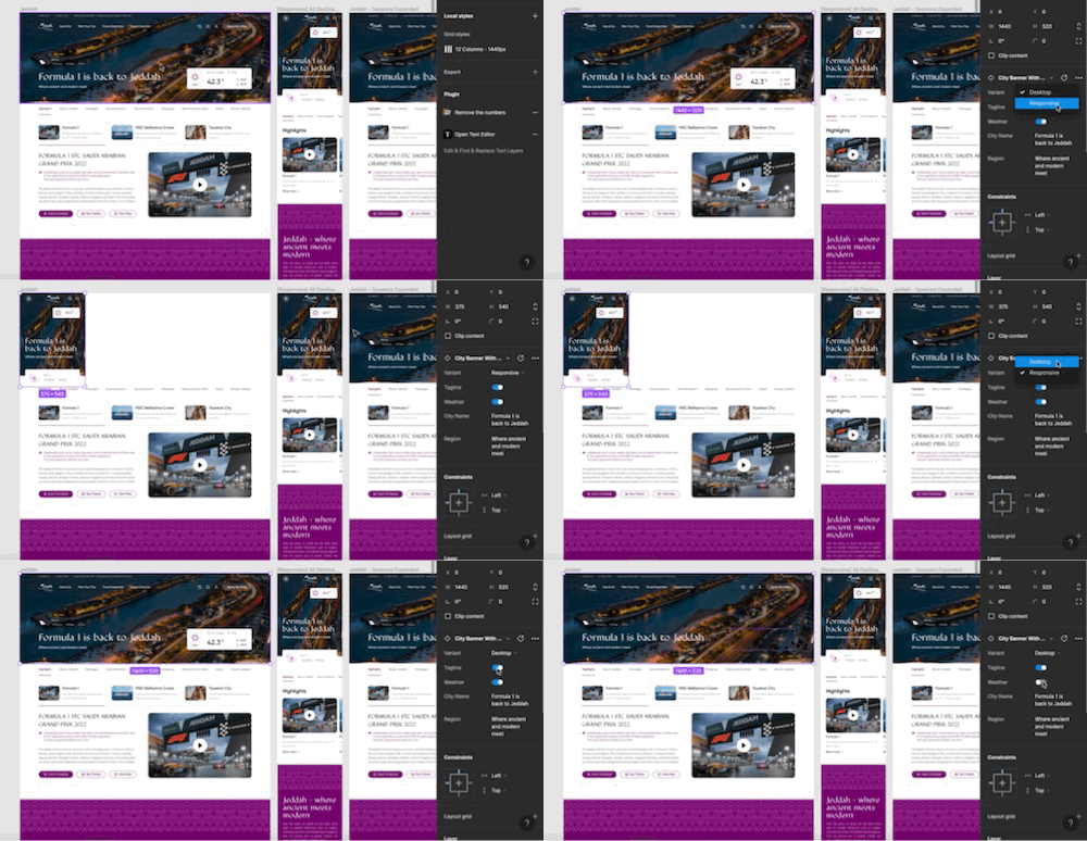
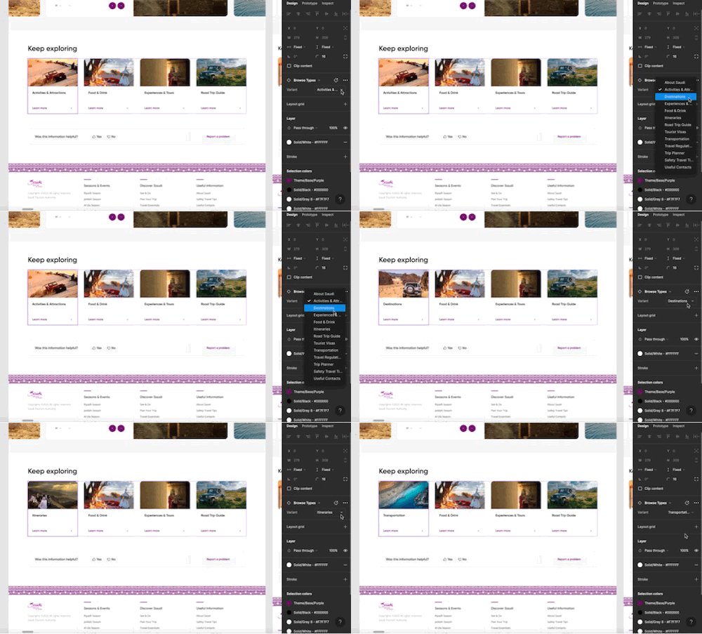
After considering all the use cases for each component and what do we need it for. Component properties allows you to alter specified parts of the components, setting the properties for each component helped us in designing in effectively eliminating the time we can consume to change something in the component.
We mostly used the Variant property and Instance property. Below images is an example of how did we use these two properties
Outcome
For this product, building a unified design system with a team of 3 members on an existing product helped us to ensure that all new products follow the same experience, accessibility, and performance standards.
It definitely reduced the time to design wireframes and mockups. The system was created to provide multiple variations of each component while keeping it streamlined and clean. Adopting the DS enabled us as a team to rapidly prototype new features, and improved the onboarding process for new designers and developers.