Information Architecture Revamp
Information Architecture (IA) is how users perceive the information, products, and services as places made of language, and these places can be arranged for ultimate findability, and understandability. A full discovery has been made for website information architecture to identify current pain points and find the best solutions.
Framing the problem
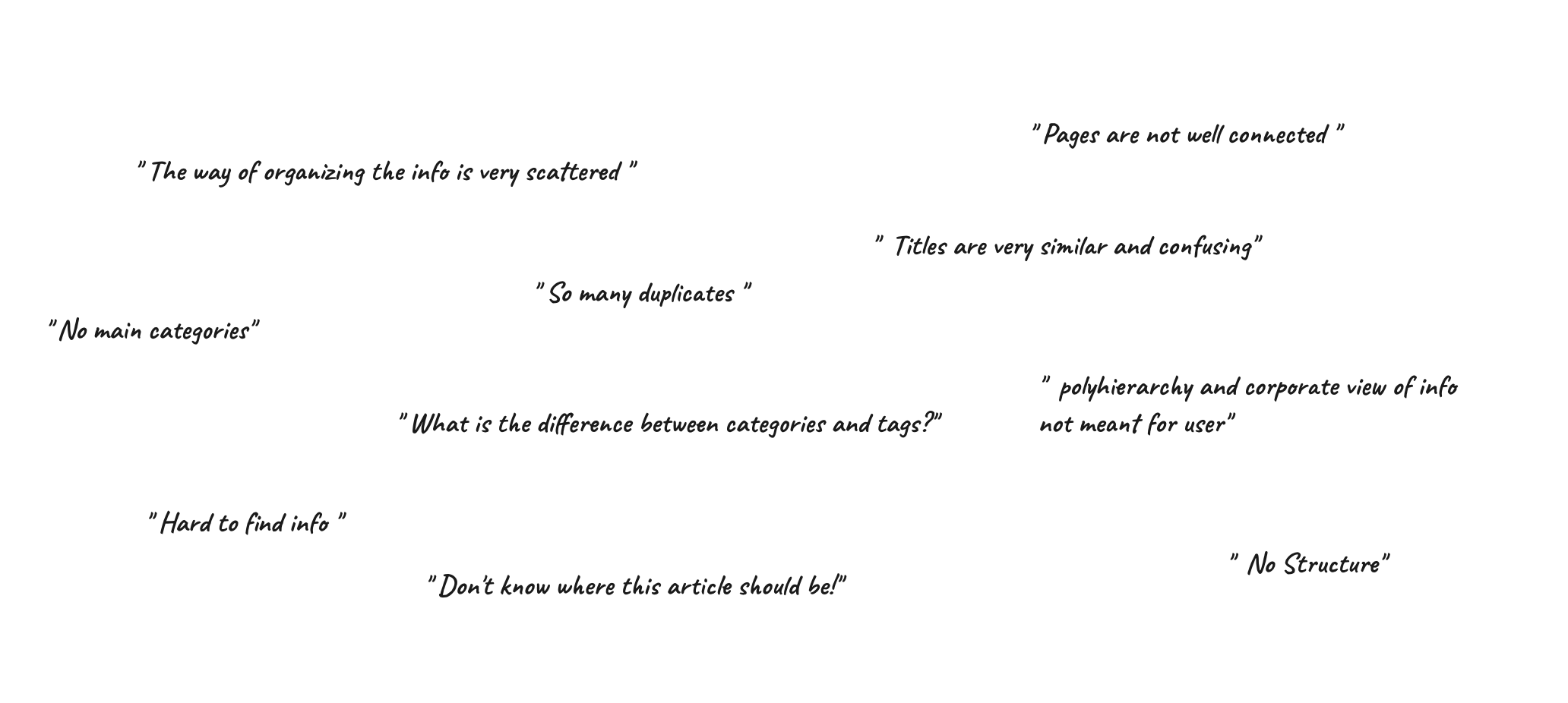
The way we group and organize the info is making users miss and can't find relevant info, and even difficult to examine or skim the desired info, and this is causing pain in the journey and low user satisfaction.
Setting the goal
Discover what the biggest problems surrounding our information architecture are, and how to solve them
Knowledge Objectives
Understand how our users seek Information by studying the user's journey and analyzing the user's sessions.
Analyzing data, and heatmap to find where the gap lies
Gather all types, tags, and categories that we use and other teams defined
Conduct usability testing to capture the user's pain point and feedback
Conduct card sorting and tree testing exercises to understand how our users are grouping and seeking the content and then testing it
Present some Hypotheses on how we can solve the issues
Define the website's information architecture, main categories, and breadcrumbs/URLs structure
Journeys & Data
Analyzing users journeys
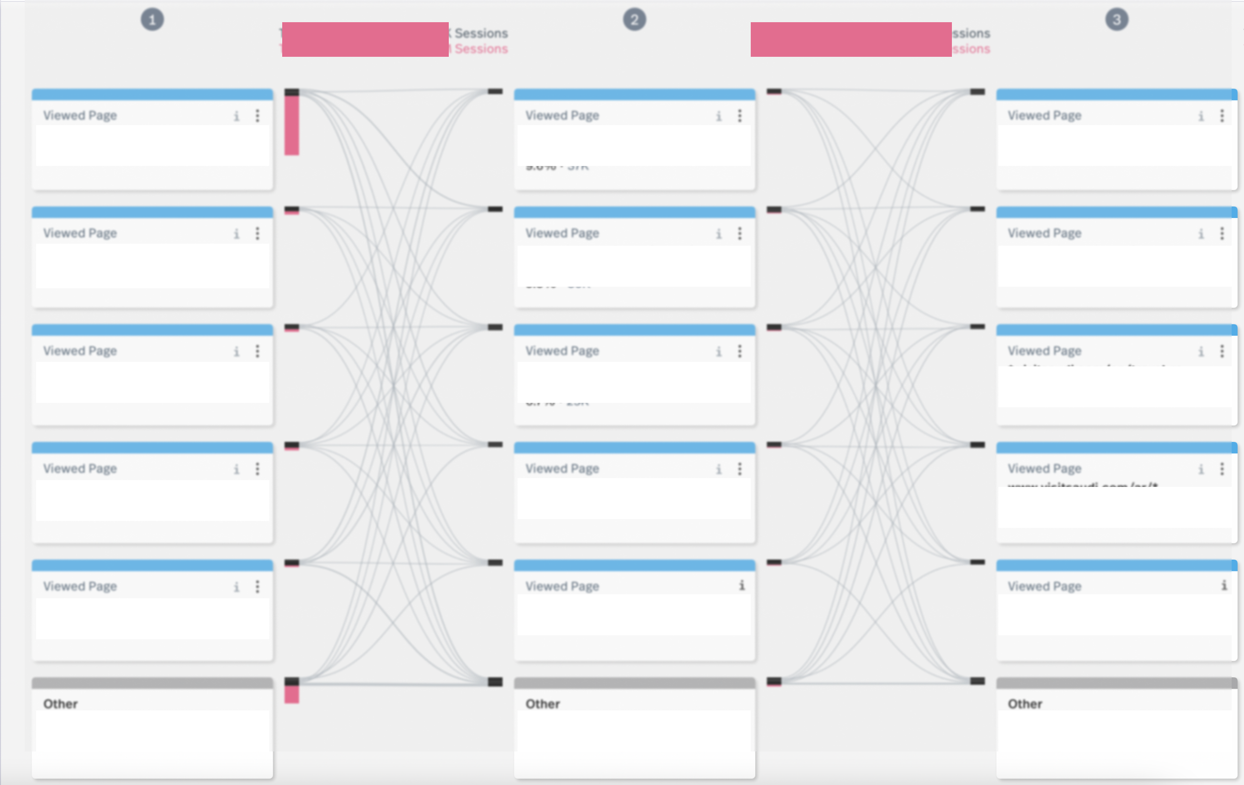
Analyzing users heatmaps
Rage clicks
User Research
Desk Research
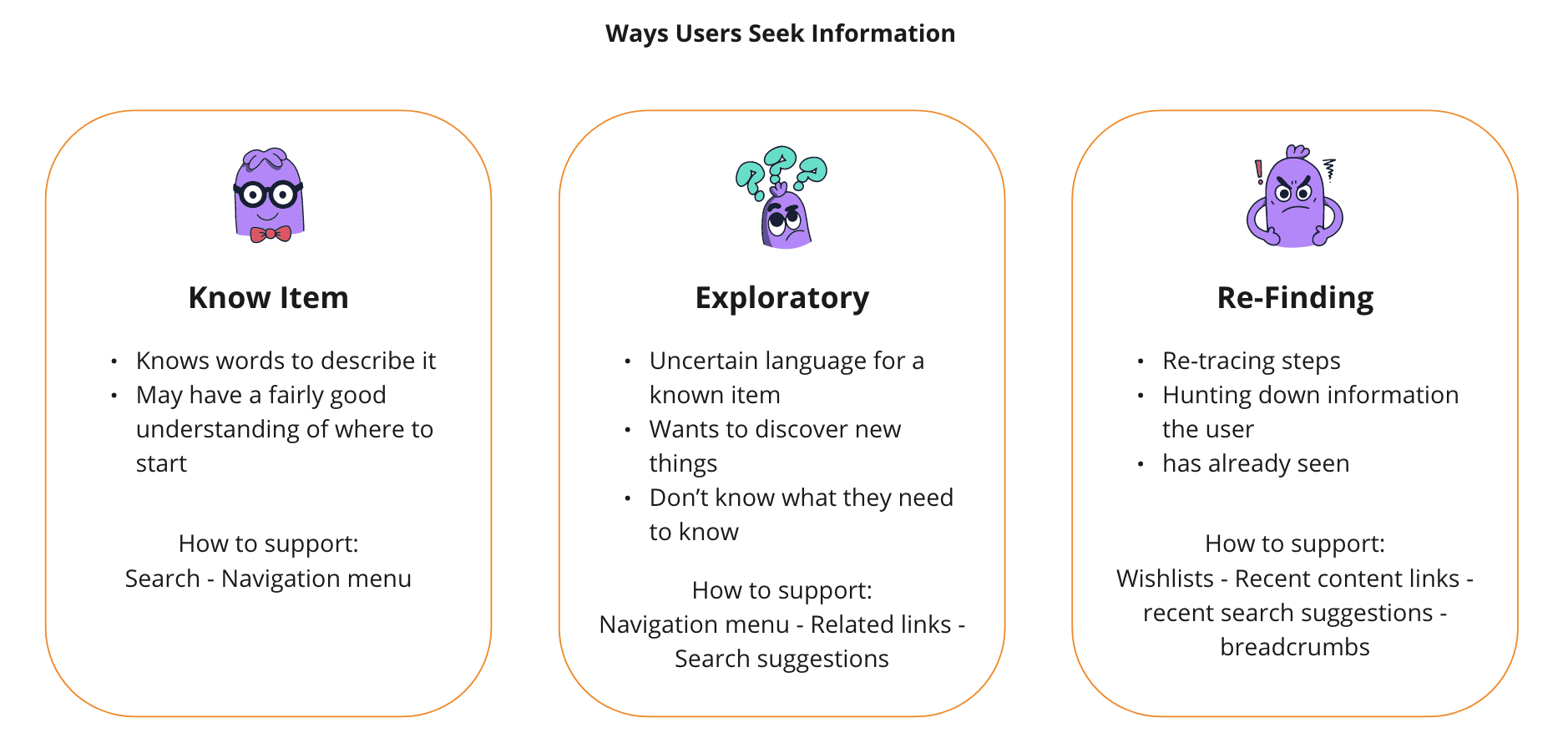
Sources: Information Architecture on the World Wide Web, Peter Morville and Lou Rosenfeld Practical Information Architecture, Donna Spencer
Narrow and Deep Hierarchies
Higher interaction cost to reach content
Top-level items are typically vague
Harder to make structure visible in navigation; often results in long breadcrumbs or multi-level drop-down menus
Broad and Shallow
Crowded global navigation
Potentially overwhelmed users
Users will probably skip some options
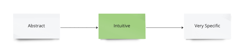
Conceptual Hierarchy
Intuitive (“basic”) categories are often found in the middle of a conceptual hierarchy.
Polyhierarchy
A hierarchy that allows for an item to have more than one parent category.
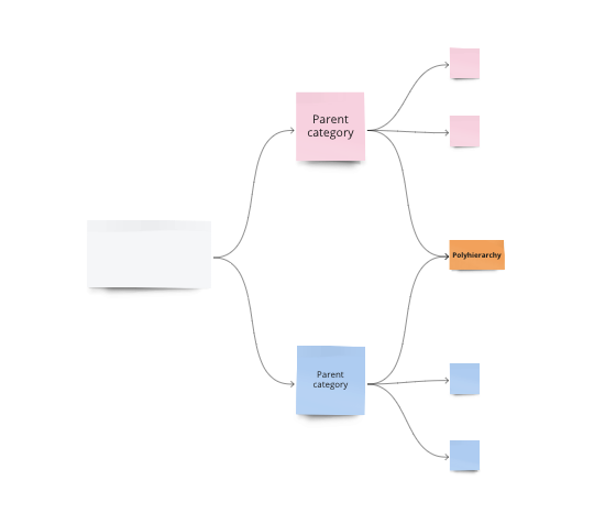
https://www.nngroup.com/articles/polyhierarchy/
Source: Women, Fire, and Dangerous Things, George Lakoff
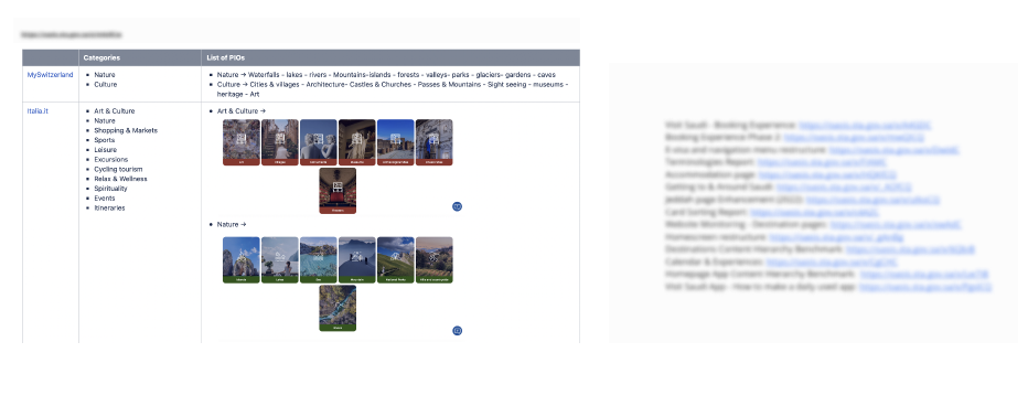
Benchmark
Usability Testing
Main Insights:
The fact that there is no ‘buy now’ upfront is seen as a good thing and not ‘too pushy’
It became apparent to users that the level of information in the website – in terms of what to expect -
For some it was clear that booking should be done via calling a local number while others give no information on how to book.
Navigation and categories
Web Inventory & Audit
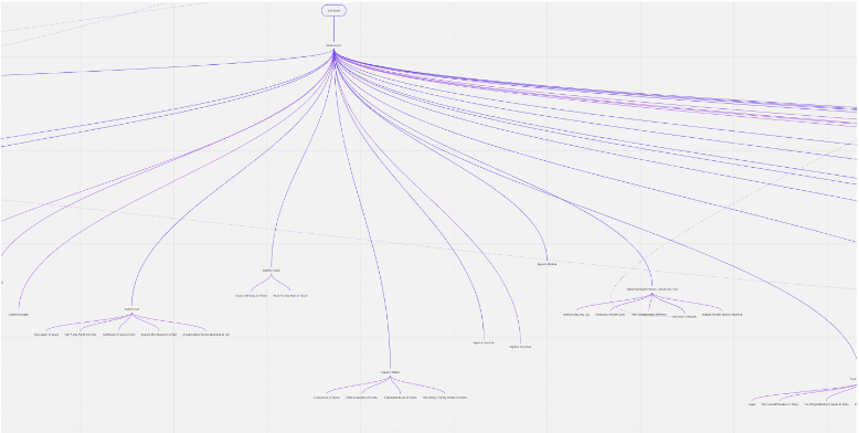
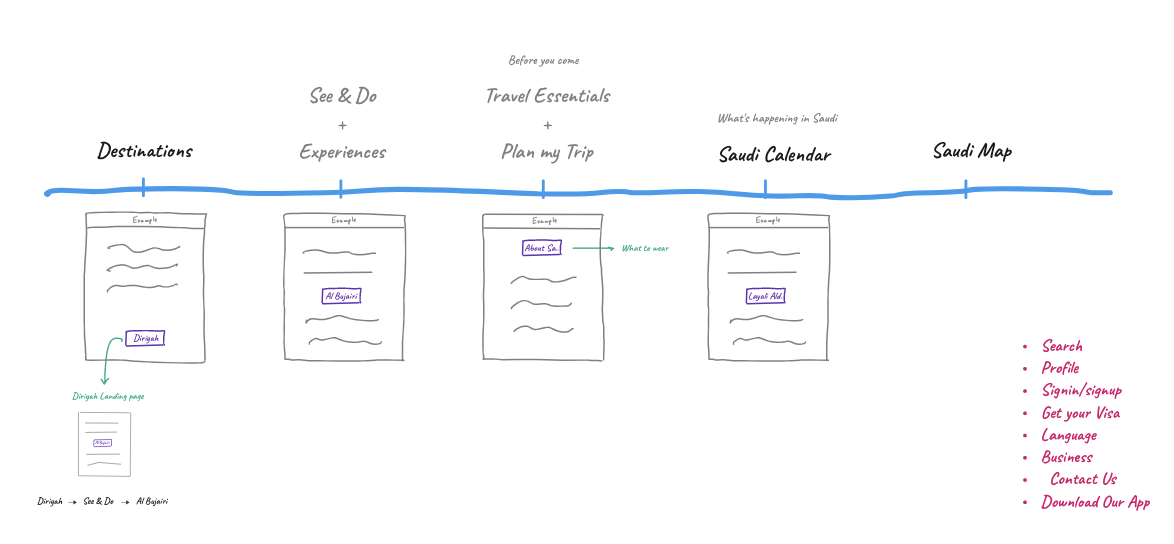
Web & App Navigation menu (high-level)
Card Sorting
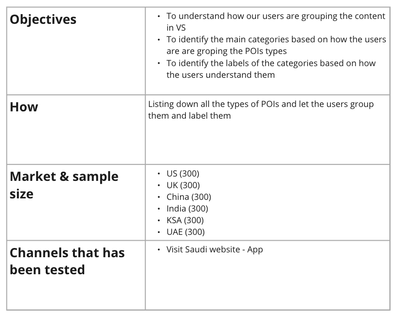
Test details
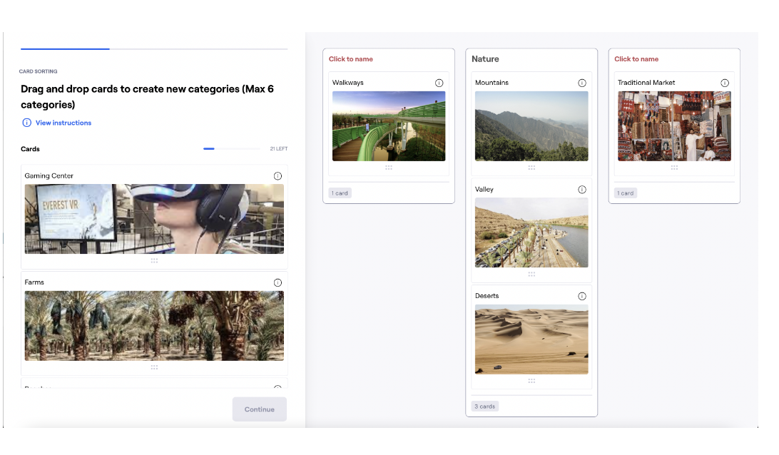
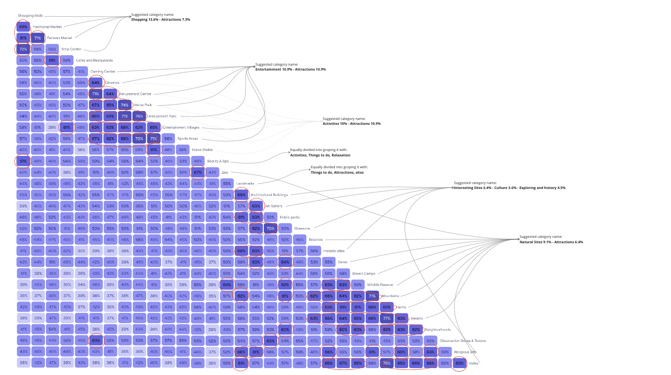
Similarity & Agreement matrix analysis (Maze)
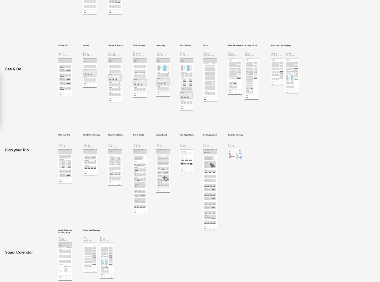
Page Hierercahy
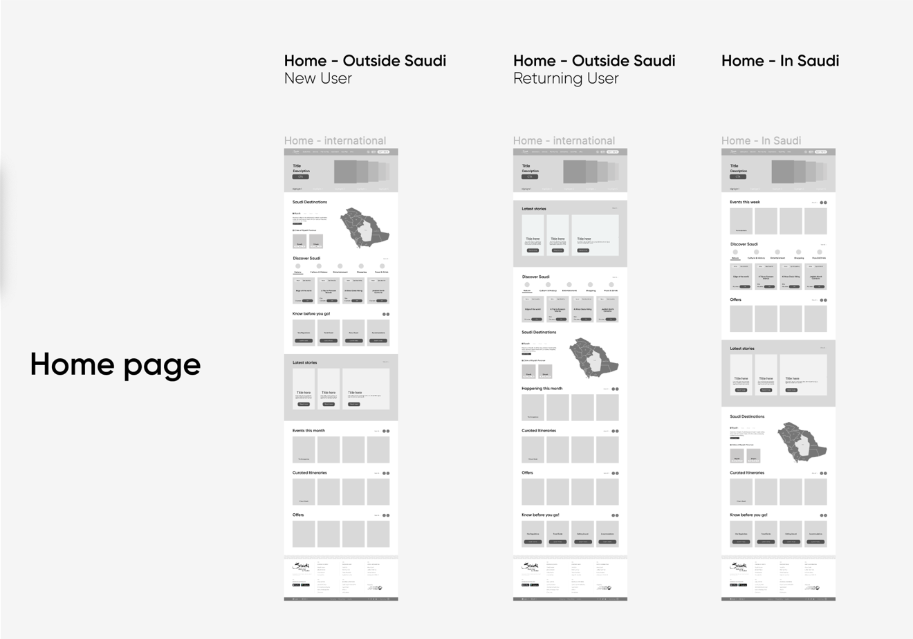
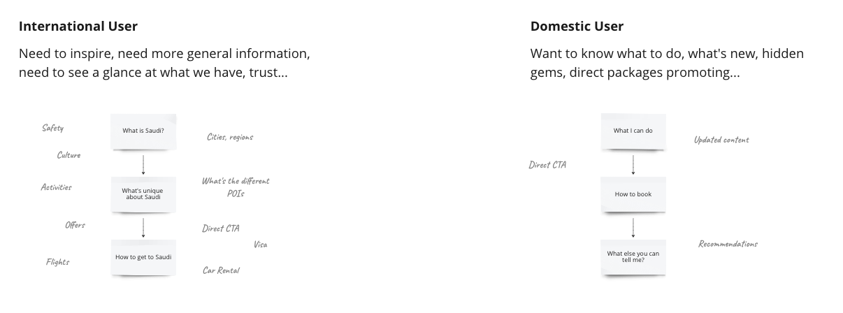
Personalization
By continuously studying our users and analyzing the user's sessions we have reached a high-level understanding of the user's need
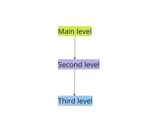
Tree Testing
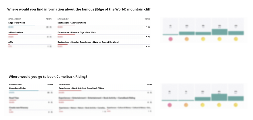
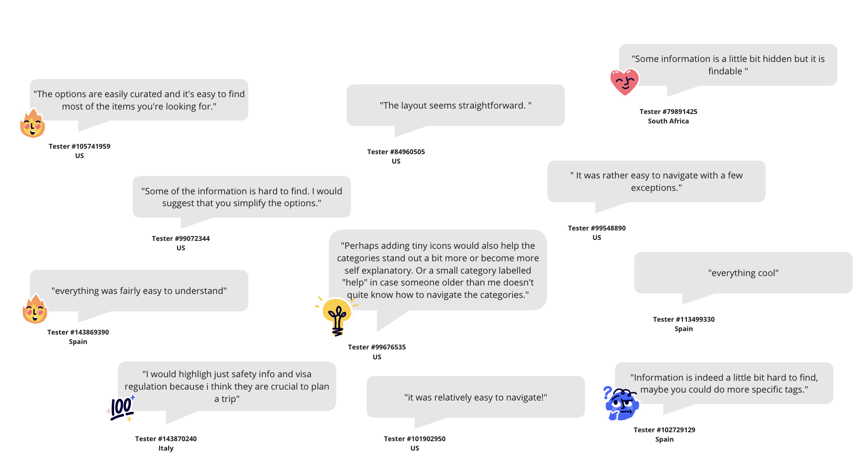
Tree Testing - General Feedback
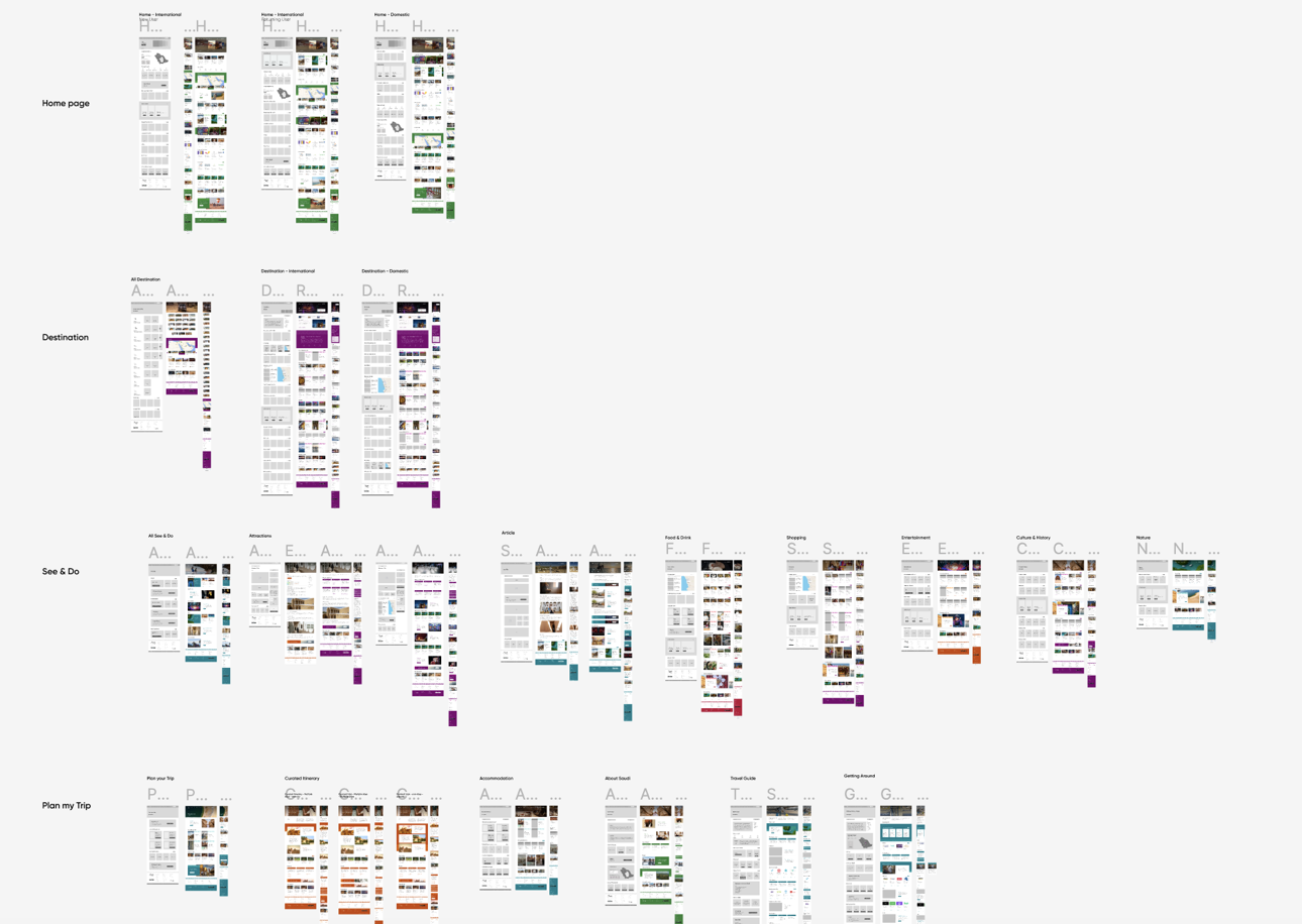
(Wireframes + Mockups)